Wednesday 30 November 2016

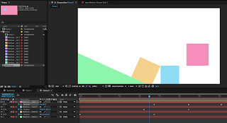
illustration 1: storyboarding workshops


 I found the storyboarding workshop really useful. Having never really done animation or storyboarding, it was really interesting to be able to see and know what I would be doing. As a person who likes to know exactly what they're doing I think storyboarding is a useful tool to me.


notes that I made: 

simplify things - you're too complicated

if you're doing a walking cycle dont show the legs and do them bobbing up and down - useful !!! look @ simpsons etc

framing - images can go beyond the frame

don't be scared lol

not everything in the frame has to move
Monday 21 November 2016

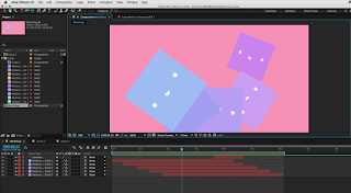
illustration 1: after effects workshop 3

right click on the keyframe > toggle hold keyframe > keyframe is held in position until next keyframe and then jumps into position

for example > the raindrop goes back to the cloud without going vertical through the sky

making something flash > toggle hold keyframe > opacity from 0% to 100% > instead of fading in and out > now it flashes

duplicate layer > cmd D

to move duplicated key frames > click position to highlight all key frames > now you can change the position

to group layers > parenting feature > make the other layers all parent to one layer


illustration 1: screenprint positives


screenprint positives!!!! so cool!! I used the big cintiq tablets in the studio to colour in with so that it would feel more real and i just wanted an excuse to try them out. I really love spot colours I'm so excited to see how these will turn out. I'm going to get into the print room as soon as I can to start printing these babies. I'm so pumped and ready to get my screenprint on!

Saturday 19 November 2016

responsive: illustration friday - spider

so this week's theme was 'spider'. one of the animals that I hate the most on this earth and i totally blame my mum for making me scared of them. because i have such a fear of them i thought i would make this week quite cute and fun because i think that shines a light on my kind of style quite well. my style has always been 'cute'. 
i used ink and white pen to do this little guy and i really like the texture on the body of the spider and how you can tell it's handmade. i then touched it up on photoshop, making the background white and playing with the levels a little bit to make the black a bit more darker and prominent as the picture that i took wasn't very good.

Friday 18 November 2016

illustration 1: after effects workshop 2

to move or elongate the sequence -
highlight all the laters
hold alt
drag the first or last key frame to move the whole lot


how to export files

make sure you save your work in the same place as the photoshop files or pictures you're using or you'll break it

composition > add to render queue > a new tab will appear

best settings > set time which you want to export > work area only (if only wanting a section)

lossless > format: quicktime > format options > video codec: h.264 > output to: file name & stuff

press 'render' on the right hand side

Tuesday 15 November 2016

illustration 1: nearly there


these are my sketches that i redid after my little talk with teresa. i'm really happy with how these have turned out and i think my idea is so much stronger now after making those little changes. i'm really excited to get these onto photoshop and finally get to printing them!!!! yay.

Monday 14 November 2016

illustration 1: after effects workshop

some notes about after effects

Composition - New Composition 
Preset - HDTV 1080 25
Duration - 10 secs
Background Colours

Layer - New - Solid (just for simple demonstration)
Can move the layer - Change the timeline
Spacebar to play animation
Drop down menu under timeline layer 
Transform tools
Can change scale, rotation etc.

To change layer colour after - 
Layer - Solid Settings

Keyboard Shortcuts 
Position - P
Rotation - R
Opacity - T
Scale - S
Reveal All Animated Properties - U
Anchor - A
Grab Anchor Point - Y


really enjoyed this workshop!! it was super fun to learn something completely new! i've never had any experience with after effects, so this workshop already differed from all the others we had been doing where I sometimes felt like things were getting repeated to me.
the software was eventually quite simple to use once i got the hang of it and i had so much fun creating cute simple little animations. 

Friday 11 November 2016

illustration 1: more artists

so i was scrolling through instagram when i picked these up. I have accumulated these in the past week or so and i have loved looking through all of their work and seeing how they use their printing processes. It's so funny how having a project at uni can make you so much more interested in things you wouldn't have really noticed before. 

most of these artists are lino printers as these seem to be popular videos on instagram. however, it's not like that's a bad thing.

rarepress. 

i found this artist and was so interested in their lino cutting videos. it's so satisfying to see them glide through and cut so easily. they make it look so easy! what i really like about their work is how delicate it is and how they make things that wouldnt seem like they could be linoprinted possible. look at the tiny details of those flowers!!! it's so amazing. i hope one day i can become as skilled as they are.


 Lili Arnold is another illustrator that i found using the printing process. Her work is so colourful and inviting. She works with a lot of florals. This seems to be a bit of a theme within the linoprinting community. But its not a downside as her works are super lovely to look at.
i found this image and was so amazed at the tiny details and how perfect these look. they don't even look like lino cuts!!! how did they get their lines so perfect? its wizardry. i swear there is a hack or something and they're all just tricking us into thinking we're really terrible. i must practice more to become this good!!
another amazing linocutting artist. I was really interested in this one because they used many little lino cuts into one piece too. Like the colours of the flowers. I never even thought of putting two together so i think this is really interesting. I would've loved to give it a go if i had different coloured inks which I sadly do not but in the future if my collection ever grows this will be the first thing that I try and conquer! 

Tuesday 8 November 2016

illustration 1: talk with teresa

so... today i had a talk with teresa. she basically told me everything my lil brain didn't want to hear. that my idea wasn't working. at first i was so peeved, like i thought they looked great and i was finally super happy and then it all came crashing down like i had just wasted my life. but as i've come to thinking about it, i've realised that she knows what she's talking about and i totally see what she means. my ideas didn't really have a narrative. it went from one panel to the next, a little zoom, nothing really happening. the only one with more of a narrative is the flower one where he is smelling the flower, so he's doing something different in the next panel. she was saying how there needs to be something different about the next panel, something we don't see in the first panel. and now i'm totally like 'YES I GET IT' and i totally agree. 

so my little meltdown at home where i wanted to throw my sketchbook into a river along with my body was completely unnecessary and i have come to realise that i am a complete over-reactor. is that a thing? well i'm making it a thing. i think i need to think things through more before decided that i'm worthless as a human being.

ANYWAY. meltdown over, time to get back to sketching !! 

Monday 7 November 2016

illustration 1: screenprinting


i really enjoyed screenprinting !!!! going into this induction i felt unsure because last time i did screenprinting (last year) it turned out terrible and horrible and everyone's was so much better than mine and i vowed never to go back to this horrible medium. but here i am, and here i am actually enjoying and loving what i did! i think what happened is because i thought screenprinting had to be super simple so my last one was boring, so i thought after learning about spot colours i would go for it and try and print something with more oomph! and boy am i happy. i love this little print. he is so adorable. i think it's one of the best things i've done. and  that makes me super excited to do some more prints and i think this has helped me to decide that screenprinting is what i want to do! i am going to play around with spot colours and all those little things and make some awesome screenprints! watch this space !!

illustration 1: software workshops


today was really interesting in seeing how our screen prints will work, we learnt how to use the multiply tool to replicate what the prints would look like when they came out. As in, when the two colours overlap and create a second colour. Learning about this feature was really handy in choosing colour schemes for our prints because we can see how it will come out and which parts to overlap. I found that I really loved the pink - blue colour scheme and I think the colours compliment eachother really well.

11/11/16

spot colours

today we learned about spot colours. this was really helpful and I think it's changed how i'm going to look at screenprinting. I really want to test it out on one of my own designs but I think that it really adds depth into the images and makes them look more interesting. I kind of wish I had known about this technique last year when we did some screenprinting because mine came out so bland and flat and some different depths of colour might have been interesting. Oh well. C'est La Vie. I think that this is my time to test out new techniques!


Saturday 5 November 2016

illustration 1: monoprint fun

illustration 1: playing with lino

lino is cool. i've never delved into the depths of lino before so this was really fun for me to try out. i bought a lino kit from amazon, because i am a woman who likes to be independent in her artwork and i really wanted to be able to do it at home. these first few tests have been kind of disappointing though. i really thought they would turn out better than they did and i'm not sure what i did wrong which is stressful. i even made a tiny little stamp thinking that it would turn out better and even that turned out pretty rubbish with only a few looking good. the stamp actually looked better on the cloth as i was wiping it off!! so i took a picture of that because it was kind of a funny/annoying/cool mistake. obviously not really wanting to do my final pieces on a baby wipe. will have to play around with lino again to try and work out what went wrong with this one, but ill keep the little dudes that i cut out for when i finally get it right.