Thursday 30 March 2017

illustration 2: magazine publishing

As one of the ideas that I have for my Application part of this project is a publication or horoscope page in the back of a magazine, I thought I would do some research on what it's like to get into magazine publishing and if it would be possible for me to do it.

I found these tips from: http://www.writerswrite.com/journal/jun03/eight-tips-for-getting-published-in-magazines-6036

Tip 1: Do your Research
Tip 2: Discuss the Idea With the Editor First
Tip 3: Submit a Proposal
Tip 4: Listen to the Editor's Advice 
Tip 5: Grab the Reader
Tip 6: Submit Articles Electronically 


I found another list quite similar  to this from: https://goinswriter.com/how-to-get-published-in-a-magazine/

Step 1: Start with a topic

Think of an idea that is original, interesting, and compelling.
Try to do some free-writing or mind-mapping to flesh it out on paper.
Focus on what you know, on what you have a unique perspective on.

Step 2: Make a list

Do some research. Take note of a few publications you’d like to pitch. Make sure you have a good variety. This will increase your chances of getting published with one of them.
I usually pick a few smaller and larger publications when I do this. I vary the list to improve my chances.

Step 3: Write a query letter

Query letters are short, formal letters that you send to to the editor to consider you for publishing. If the magazine has more than one editor, send it to the person who accepts pitches for your particular topic.
Address him or her by name, include the date, and pitch the idea in a short outline form.
It’s also a good idea to provide some sample work that you’ve done (in the form of links, preferably, if you have published anything online).
If appropriate, try including more than one idea in the letter. This will increase the likelihood of getting a response.

Step 4: Wait

This is important: Give the magazine adequate time to respond.
If they have a policy for pitching articles, read it. Most likely, it will be something like this: “If you don’t hear back from us in [X amount of time], you can trust that we weren’t able to use your piece.”
Wait a week or so before following up. If you don’t hear back within a few weeks to a month, send a letter to the publication, telling them you’re moving on with the idea. When in doubt, ask permission to follow up. For example, if I’m wanting a quick response on a piece, I may say:
If I don’t hear back from you in a week or so, would it be all right for me to follow up?
If they say yes, then you never have to feel awkward about sending a follow-up.

Step 5: Follow up

If they do respond to your pitch, they will tell you one of the following:
a) They don’t like the idea.
b) They want you to tweak the idea.
c) They want to publish the idea.
Oftentimes, I go back and forth with a publication before we land on a good idea.
Once you land on a good idea, they may ask for outline.
Once you’ve agreed on a deadline, then it’s time to start writing. The hardest part is done. Now, all you have to do is write the article. And next time, you probably won’t have to go through this process. The more you do this sort of thing, the easier it gets, especially as magazines and editors begin to know and trust you. 


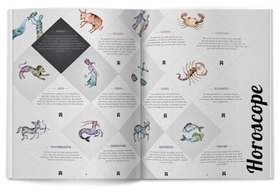
  • It seems like its quite hard to get into publishing for a magazine or article paper. However I feel like it's different for horoscopes because there's always one in there somewhere so there's always a market for it
  • One thing that I could do is work with the writer for the horoscopes and just submit my designs to them instead

Tuesday 28 March 2017

illustration 2: mystic meg

Image result for horoscope at the back of magazine


Image result for horoscope at the back of magazine

One of the applications that I am looking at for my end illustrations is Horoscopes at the back of magazines, for example 'mystic meg' etc. I really this this is a good application for my illustrations because it is something that's really relevant. It would give my work a chance to be seen by a lot of people and i think a lot of people would find it interesting as to why I have drawn the characters these ways and want to find out more. 

Sunday 26 March 2017

illustration 2: face shapes


I made this little diagram to show myself that I keep drawing the same face shape. After watching the Appeal video from youtube it's put a lot of things into perspective for me. Their faces are not interesting enough, in my opinion, and it causes my characters to lack personality. The video mentioned exaggerating certain features, which I think I haven't done at all. If they're all the same then it makes it less life-like. I wanted to redesign their face shapes to make them all different and unique, trying to make it sort of fit their personality.

Before I did this, I tasked myself with trying to draw as many different face shapes as I could. I think this is good practice for me as someone who doesn't take much time to rough things out and practice. 

It was really interesting for me to challenge myself into how many unique face shapes I could create. It has really put some things into perspective for me, and I think I have learned a lot from this process.


I then wanted to dedicate a page to me just testing out using all these different face shapes. I wanted to see if I really could create characters that looked different and unique. I think this was quite successful and I managed to make quite a few new characters. I am now more confident when thinking about redesigning my characters and have more of an idea about how I should approach it.

Thursday 23 March 2017

responsive: collaborative submission!

so today was the day that we finally submit our collaborative responsive brief! it's been a good journey for me, as a creative i feel like i've learned a lot of things about myself. i hope that in the future i will collaborate more so that i come to understand myself more as an illustrator.

here is the final proposal that we wrote for our project:

For BEAR, we wanted to do something a bit different. Fear is something you often try to avoid talking about with children, but it is such a fundamental part of life and development. We wanted to create a set of cards, showing how fear doesn’t have to be too scary. I think children will also find comfort in knowing that they’re not alone in their fear. Fun facts and jokes to make the fears not seem so scary anymore, making children more confident and able to overcome things.
Kids will be able to collect stickers to add to their BEAR poster, giving BEAR his ‘armour’ and able to join him fight against fears. We want kids to know that it’s okay to have fears, and give them confidence that they can overcome it.

here are some screenshots of us submitting the work:


the email i received!:


responsive: last minute decisions

the last task that i wanted to do was to create a mini mock-up poster of the 'sticker' poster. i wanted to do this because i feel like our project was lacking and i wanted the people reading our submission to know what we meant when we said we wanted a poster. i just used the bear drawing that had already been done, as there wasn't another i could use:


i think that for last minute mockup before we submitted it came out quite well and you can get the idea of what we were going for. 

Wednesday 22 March 2017

responsive: development of our cards


 A little presentation with a collection of things i've compiled together which i think are important to show the development of our cards. It's a bit of a random collection with some some timeline.


Tuesday 21 March 2017

responsive: doing the text

so i've been given another job to do, my teammate doing the layout has said that they are not confident with doing fonts/typography. i myself do quite like to do fonts so it's not a problem for me to do it, it's just something else that i need to make sure i have time to do. i decided to just use a simple handwritten font, because it's for children i don't really want something too complicated, just easy to read.

inspiration: 


Image result for handwritten children fonts


finished writing:


I used a simple ink brush, so that the letters were bold and easy for children to read. I didn't want it to be too complicated. However I used a different brush for the main titles so that they stand out a bit more for the front of the card!

responsive: finally colouring!

so this weekend i have finally been able to do my bit to help my team! i have started the colouring of our little bear project. i'm really excited as i have felt like i wasn't helping as much as i could! i'll be using my new photoshop brushes and getting a nice gouache feel!


here are the finished colourings! i'm really happy with how they game out and i feel like the gouache works really nicely, tying in different effects and making the digital not seem so rigid. I feel like kids will like looking at things with more of a painterly feel rather than such a rigid feel.

we decided to leave out heights and spiders, although we were going to do this, we were pressed for time and thought that making more work for ourselves wasn't worth it. there was also no drawing for heights, so i didn't have anything to colour. 

we were also going to do a mockup of the poster where the kids could put 'stickers' on but it hasn't been drawn so i don't really know what to do. whether to try and figure something out myself, because my teammate supposed to be doing the drawings has something they need to be at home for.

Monday 20 March 2017

illustration 2: appeal


I was with my friend who does animation and they were researching into the 12 principles of animation. There was a video that particularly interested me, and although I dont do animation, I think it's really helpful to me. The video talks about making characters have 'appeal'. Exaggerating certain aspects of the character makes their appeal grow, which I think I need to try and achieve with my own characters. If they are not exaggerated at certain points, they have less character and look static and boring. I took this video into consideration when looking again at my characters.

The video talks about how appeal is subjective and how everyone finds different things appealing to look at. I agree with this statement, and I want to create my characters that are for the most part appealing to me first. It talks about making a 'dynamic design' to boost the appeal. It also talks about using different shapes for each character which I think that I need to achieve. Looking back at the ones that i've made I think I need to think about this, as even their face shapes are really similar. 


Saturday 18 March 2017

illustration 2: horoscope book


So I found this book by Marion Williamson on ASOS which is basically one of the ideas that I had and thought no one would buy. This is super crazy because I didn't know there was such a market for it, but it's interesting to see it. Most of the horoscope books that I've looked at in the past are very information based and not very nice to look at, so it's cool to see a little book about it that's not so formal. Maybe in the future I would think about making my own little book but right now I kind of want to just focus on the character design.

Thursday 16 March 2017

responsive: i get stressed easily

So last night I was having a bit of a stress. My group member sent me the work that they had done for the layout, and I didn't like it. There's something in me that makes me such a perfectionist when it comes to doing work, I always have an image in my head and when it doesn't turn out like that, I go into some sort of meltdown. 

I wasn't exactly sure what I was going to do or say, is there a way to tell someone that you don't like what they did? That feels so awful. Working in groups is hard. I have such a particular way of doing things, I feel like I turn into some sort of dragon lady when it's not going my way.

After stressing all night on what I was going to do, the next day, I talked with my other group member and they agreed that there is some changes that we need to do. So we set about doing some sketches and working more things out on how we wanted the final designs to look. This made me feel more relieved and that I could chill out a bit more.

When it came to talking with my group member about the work, it was totally fine. We worked everything out together and she agreed with the new designs that we had come up with. I felt so much better, and through this, I've learnt that when it comes to critiquing other's work, you have to be honest. Working together is about creating something between you that you are all happy with, and when you're not happy, all you have to do is talk it out and be reasonable. Through this process I feel like I've come out with a better level head and being able to collaborate easier.

illustration 2: character design references

There is a website that I have discovered which is also on Pinterest, which is called 'Character Design References' found on: https://www.pinterest.se/characterdesigh/.

This page is really helpful to me as someone who often struggles trying to figure out posing for my characters and how I want them to stand. It's good for me to study different areas of this and do practice sketches. The breadth of references on this website is so useful and I wish that I had found it earlier. 


Wednesday 15 March 2017

responsive: leaving it late

there's one thing that has been difficult with this project. time management has not been great within my group and i think we really could've done much better. as i am the last step, the colouring, i have been waiting for my other team mates to do their part. i've been trying to help here and there, giving ideas, brainstorming and finding the facts and names of the fears. 
however i can't help but feel like i'm not doing anything. i want to do more. i sort of wish we had made a timetable of when we wanted things to be done by.

EDIT: 17/03/17

so it's a week before the deadline, and i've only just gotten all the drawings and images that i need to colour in. i feel like this is so late and i have to make up all the time that we've lost. i have to do the colouring, all the typography, backgrounds and i feel like i would've liked more time to get everything done by. i will be able to get it done, but it does mean having a few late nights and just working a lot. 

i can't say that i'm not at fault either, and should've encouraged my team to keep more time management. i think it's something that i have learned if i work with a team in the future, especially if i am the last step to make sure my team and i work together in keeping good time management and making sure the project is running smoothly!

illustration 2: history of horoscopes

The word Horoscope comes from the Greek word Horoscopos, which means hour watcher. Today the word horoscope is used to describe the forecast made based on the chart that has been erected. With the use of Astrology, a horoscope can be erected for a person, a business, a city, or a nation.

www.horoscopeswithin.com/astrology.php

'Astrology relies heavily on our "selective memory", a tendency to remember successful "predictions" and forget missed predictions.
For example, if you read the typical characteristics of your zodiac, you will find multiple common matches, which you will automatically accept and multiple mismatches, you will simply ignore.'


- I think this is a really interesting statement and rings somewhat true. You read your horoscopes wondering what will happen to you over the next month or day, if one thing comes true then it means that the horoscope is a genius and you seem to ignore all the predictions that didn't come true. 


Astrology is either an ancient and valuable system of understanding the natural world and our place in it with roots in early Mesopotamia, China, Egypt and Greece, or complete rubbish, depending on whom you ask.
But newspaper and magazine horoscopes? The ones advising you to not “fight against changes” today, or to “go with the flow”, whatever that means, or to “keep things light and breezy with that new hottie today”? They get even less respect, from both skeptics and true believers. So it’s a bit surprising, then, that they remain so popular with everyone in between.
http://www.smithsonianmag.com/history/how-are-horoscopes-still-thing-

Early astrological systems were concerned with weather patterns, seasons and crops. Because early humans didn't understand the causes of things like eclipses or the retrograde movement of planets, they created stories, passed on for hundreds of generations, that tried to explain them in a context they understood. Shapes in the stars and the planets themselves became gods -- or at least symbols of gods. Every ancient culture had some form of science/religion that was concerned with patterns of movement in the stars. At this point, astronomy and astrology were one and the same. Ancient scientists observed and recorded the patterns they saw in the sky (astronomy); then, they extrapolated those observations to fit their cosmology and life experiences (astrology).
The Mayan, Aztec and Inca cultures of South America had complex astrologies based on a zodiac of 20, including symbols like the jaguar, the earthquake, the ape, rain and the dog (Snodgrass, pg. 13). These systems have not been passed on or incorporated into modern astrology because the civilizations themselves died out.
The Chinese had developed one of the most complex astrological systems by 1000 B.C., with some characters in written Chinese languages corresponding to their constellations. This system combined 24 divisions of the year with a 28-part lunar zodiac, as well as 12 branches that correspond to an animal (Campion, pg. 13). Someone born in a given year is thought to have certain characteristics -- for example, 2005 is the Year of the Rooster. In addition, each year has an element associated with it, further delineating someone's type as, say, a Fire Rooster or a Water Dragon.
In the 16th and 17th centuries, Jesuit missionaries brought western astrology to China, where it was incorporated to some extent into the traditional Chinese system. Today's Chinese astrology is a simplified system which only takes into account the animal years.
The western zodiac itself, the foundation of much of astrology, has followed a winding path before it became the system with which most of us are familiar. The Babylonians are usually credited with creating the basic system, assigning certain characteristics to the planets of which they were aware. These characteristics were based on the Babylonians' observations and their metaphorical ideas about what these observations meant. Because Mars, which they called Nergal, was observed to be red, and blood is red, they aligned Mars with war. Ishtar, or Venus, appearing in the early evening when lovers were likely to be outside spending time together, was made to represent love and fertility. Mercury, hard to spot and fast moving, was associated with deceit and speed (Snodgrass, pg. 17).

This general system absorbed influences from the many cultures that populated the Mediterranean and Middle East thousands of years ago. The specific names for the modern western zodiac come from the Greeks. The word Zodiac itself comes from the Greek root word zoe, or life.

illustration 2: where does my project sit?

So recently I got to thinking about other places where my illustrations might fit in the outside world. I was talking with some peers when we mentioned the thought of having a zodiac book/zine, where my images are on one side, and then on the other side there is a collection of facts/traits about that sign. I think this would be really interesting, however I'm not sure whether people would actually buy it, so there's that. 

I would buy it.

I think zodiac signs are really interesting, how do they know what our traits are? Who do they think they are? Is there signs that tell us about the different traits of the zodiacs or have they just been picked up through the years? I should research this more.

Tuesday 14 March 2017

responsive: illustration friday - punk


i decided to have a bit of a relax this week and draw something more easy and fun. In the end i really like how it turned out, i think the contrast of the black lines and the red text makes the message of 'punk' really stand out. it was nice to try and play with my normal 'style', which is what people call 'cutesy'. i like the mix of cute and punk that i have tried, i think i'll play around with style again in the future! this mini project is really helping me to find new things that i want to try, because each week the brief is small but challenges me to make something different each time.

Monday 13 March 2017

illustration 2: scene roughs

As one of my final pieces, I wanted to create scenes where the characters could sit in. I didn't want to just do a character turnaround for my final product, I wanted to show how my characters could be in a living-breathing setting. As if I was making a comic or drawing storyboards for an animation. I think this will also be good practice for me as someone who does not draw a lot of backgrounds, I want to try and become better at it. 

At first I was thinking about having them all in their own rooms, as if you could get a little look into what their bedroom would be like with all their conflicting personalities. However I don't want to do this for a final piece. I might do it as a little side image, just something extra. Although I do like this idea, I think showing them in different environments will bring out even more of their personality. It will show you where they like to hangout, activites they like to do etc.

Here are the roughs that I did for this:

  
When researching into the sign Pisces, I found that they like to be alone. They are very wise and studious. This is why all my roughs for Pisces see her in settings reading books, in little nooks. Comfortable and safe.


 Aries is the sign for Spring. Therefore I wanted to draw scenarios where you can see Aries enjoying nature and Spring itself. Things like baby birds, meaning animals are just being born, this is because in the natural cycle of life, many animals are born in the springtime so save them from going through the cold winter months as newborns.


Taurus is practical and well-grounded. They like household tasks such as cooking, cleaning, gardening. This makes them a very loving motherly figure, and I wanted to try and achieve this when thinking about my final pieces. 

Leo is courageous and outgoing. I wanted to show how I have made the character large and full of energy. There is one I particularly like where Leo is leading some animals, like the 'King of the Jungle' kind of theme because Leo's animal is a Lion.


 When looking at Scorpio it was a bit difficult at first. A lot of the traits mention it's need to be secretive and cunning. When looking at a lot of artwork for Scorpio I see that people like to run with this idea. I want to show Scorpio in a different life, being sophisticated and having fun with life. I read that they live to experience and that's what I want to show.


Sagittarius is a traveller. I really wanted to show how they relax and unwind as one of the most laid back signs. Images of her camping or meeting animals are what I want to show, and hopefully her character of freedom.

Wednesday 8 March 2017

illustration 2: researching for random things

So I thought I would make a little post about all the random things that I'm currently googling and looking at, all in the name of character design. I find it's best, when drawing, to use reference for things that you're unsure about because then you are better educated on how the things work and will produce better artwork.

curly hair

for Aries, i really want them to have curly hair so it's hinting at the ram which is the symbol for this sign. i also think curly hair is reminiscent of naivety/innocence which is described a lot for this sign.

Image result for how to draw short curly hair  Curly hair reference for guys... Totally need this!!!:
as the sign is often called 'masculine' i need to carefully draw the line between being manly, but also being naive. 

practical hairstyles

as Taurus is called a 'practical' 'motherly' sign, I wanted to research into 'mother' hairstyles, for example motherly characters and how their hair is drawn. Also hairstyles that will not get in the way.

Good Looking And Practical Workout & Gym Hairstyles -:  I want this haircut:
a lot of the hairstyles that I researched either called for short hair, or up-do's. I think this should be reiterated within my character design.
head-scarves:


Tuesday 7 March 2017

responsive: finally submitted!


I finally got my entries submitted for the Penguin Book project! I'm so happy!! It took a while to get the website to work, I suppose it's the rush of all those people trying to submit their designs. I know it's a bit last minute, but I kept forgetting to submit it and didn't have Adobe Acrobat at home so I couldn't combine and reduce the file sizes myself. I'm proud of myself for actually submitting to a real competition and hopefully something good will come out of it! But if not, then at least i've had this experience, which has been really fun and I've found that I really enjoy making book covers, so there's that.

illustration 2: crit


The crit was really helpful in helping me to define my ideas even more. There were some good suggestions, for example one that i get often, is to stay rough! keep my sketches rough and don't labour them too much. I understand this and I will definitely try. There were also suggestions for me to start thinking more about how the illustrations will sit in the world, which makes sense, as this project is a lot about application.

Monday 6 March 2017

illustration 2: characters from real life

This Artist Can Create Cool Cartoon Versions of People:

I found this collection of drawings from the artist Robert De Jesus. I think it's interesting to see how he has translated certain characteristics into his work. He takes certain parts of the person and exaggerates them, which gives them more character. I think it would be a good practice for me to try this out. I have always been someone who draws the same thing all the time and all my characters will always look the same. I want to try and break out of this with this module as I think it will be benficial to me to try new things.