Saturday 31 December 2016
Thursday 29 December 2016
illustration 1: final prints


Wednesday 28 December 2016
illustration 1: sound websites
These are the two websites that I used to find sound for my animations. I think they were really useful because they have different things like sounds (water, bubbles, birds) etc and then music that people have made too. And it's all royalty free wahoo.
https://www.freesound.org/
http://freemusicarchive.org/search/?quicksearch=water
https://www.freesound.org/
http://freemusicarchive.org/search/?quicksearch=water
Monday 19 December 2016
responsive: christmas kids


this is more of a personal brief, however i thought that i would add it onto this blog. my mum asked me to create 2 illustrations for my younger siblings for a christmas present. i think it was quite easy for me to think up different things to do for both of them. my younger sister is very attached to me and we have a close relationship as girls do, so i thought she would like to have an illustration of the two of us together.
my brother, however, is more into his games and things so as i know him quite well, i know what his favourite pokemon are, which is a video game that he is really into. so i thought for his illustration i would do him standing with his favourite pokemon, as if he himself is a pokemon trainer!
i'm really happy with how these turned out and i hope that they like them!
Thursday 15 December 2016
illustration 1: last minute monoprint fun


 So I was just playing around with my monoprints and finished positives for my screenprints and I really love how these turned out. I was inspired by the monoprint fun I did before with the little purple guy and using Murakami quotes. I think if I had been doing a book this is what I would have done. I do really like how this turned out and maybe in the future I'll do more of these and make a little zine seperate from a project.
Wednesday 14 December 2016
responsive: illustration friday - spiral

this week's illustration friday was 'spiral'! I decided to do something a bit different for this instead of the normal images for spiral you see. I thought someone being wrapped in a spiral of blankets might be a little more fun.
i used paint tool sai for most of this piece, using my cintiq 13hd. I have been really enjoying doing digital drawings at the moment and i think it's really pushing my practice further. plus for small briefs like these illustration friday ones it's easier to just grab my tablet and doodle away using CTRL+Z rather than exhaustively using paper.
Saturday 3 December 2016
illustration 1: study task 6 part 2


illustration 1: study task 6 part 1
MR NIGHT HAS A DAY OFF - short film from Ignas Meilunas on Vimeo.
I chose this animation because of the quirkiness of it. It intrigued me the way they used 2D and 3D environment together. The music is quite simple in this animation. Quite nonchalant and chilled, seemingly curious as the character Mr Night goes through the town turning things into night/dark things. I think adding the different sound effects in like the coffee splash, the dog bark, the bike etc really sets the tone of the animation and makes it more fun to watch. Like he really is interacting with the things around him. The music reflects on the atmosphere of the animation, in that there is no harsh theme or imagery, just something fun.
FURTHER - 試煉 from kai chang on Vimeo.
The other animation I have chosen is Futher by Kai Chang. I chose this one because of how different it is from the other. The theme is dark and disturbing and the music reflects that. The music comes in and out, with added silence in between, this adds to the tense nature of the animation and the music is timed very skillfully. The sound effects of the smashing, the drops, really add to the atmosphere of the piece and seem to echo around. The music picks up pace and tempo around the middle when they are fighting to show the change of drama and makes your heart race.
Wednesday 30 November 2016
illustration 1: storyboarding workshops


notes that I made:
simplify things - you're too complicated
if you're doing a walking cycle dont show the legs and do them bobbing up and down - useful !!! look @ simpsons etc
framing - images can go beyond the frame
don't be scared lol
not everything in the frame has to move
Friday 25 November 2016

Monday 21 November 2016
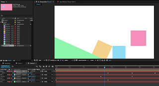
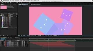
illustration 1: after effects workshop 3
right click on the keyframe > toggle hold keyframe > keyframe is held in position until next keyframe and then jumps into position
for example > the raindrop goes back to the cloud without going vertical through the sky
making something flash > toggle hold keyframe > opacity from 0% to 100% > instead of fading in and out > now it flashes
duplicate layer > cmd D
to move duplicated key frames > click position to highlight all key frames > now you can change the position
to group layers > parenting feature > make the other layers all parent to one layer
illustration 1: screenprint positives

screenprint positives!!!! so cool!! I used the big cintiq tablets in the studio to colour in with so that it would feel more real and i just wanted an excuse to try them out. I really love spot colours I'm so excited to see how these will turn out. I'm going to get into the print room as soon as I can to start printing these babies. I'm so pumped and ready to get my screenprint on!
Saturday 19 November 2016
responsive: illustration friday - spider

i used ink and white pen to do this little guy and i really like the texture on the body of the spider and how you can tell it's handmade. i then touched it up on photoshop, making the background white and playing with the levels a little bit to make the black a bit more darker and prominent as the picture that i took wasn't very good.
Friday 18 November 2016
illustration 1: after effects workshop 2
to move or elongate the sequence -
highlight all the laters
hold alt
drag the first or last key frame to move the whole lot
highlight all the laters
hold alt
drag the first or last key frame to move the whole lot
how to export files
make sure you save your work in the same place as the photoshop files or pictures you're using or you'll break it
composition > add to render queue > a new tab will appear
best settings > set time which you want to export > work area only (if only wanting a section)
lossless > format: quicktime > format options > video codec: h.264 > output to: file name & stuff
press 'render' on the right hand side
Tuesday 15 November 2016
illustration 1: nearly there


these are my sketches that i redid after my little talk with teresa. i'm really happy with how these have turned out and i think my idea is so much stronger now after making those little changes. i'm really excited to get these onto photoshop and finally get to printing them!!!! yay.
Monday 14 November 2016
illustration 1: after effects workshop
some notes about after effects
Composition - New Composition
Preset - HDTV 1080 25
Duration - 10 secs
Background Colours
Layer - New - Solid (just for simple demonstration)
Can move the layer - Change the timeline
Spacebar to play animation
Drop down menu under timeline layer
Transform tools
Can change scale, rotation etc.
To change layer colour after -
Layer - Solid Settings
Keyboard Shortcuts
Position - P
Rotation - R
Opacity - T
Scale - S
Reveal All Animated Properties - U
Anchor - A
Grab Anchor Point - Y
really enjoyed this workshop!! it was super fun to learn something completely new! i've never had any experience with after effects, so this workshop already differed from all the others we had been doing where I sometimes felt like things were getting repeated to me.
the software was eventually quite simple to use once i got the hang of it and i had so much fun creating cute simple little animations.
Composition - New Composition
Preset - HDTV 1080 25
Duration - 10 secs
Background Colours
Layer - New - Solid (just for simple demonstration)
Can move the layer - Change the timeline
Spacebar to play animation
Drop down menu under timeline layer
Transform tools
Can change scale, rotation etc.
To change layer colour after -
Layer - Solid Settings
Keyboard Shortcuts
Position - P
Rotation - R
Opacity - T
Scale - S
Reveal All Animated Properties - U
Anchor - A
Grab Anchor Point - Y


really enjoyed this workshop!! it was super fun to learn something completely new! i've never had any experience with after effects, so this workshop already differed from all the others we had been doing where I sometimes felt like things were getting repeated to me.
the software was eventually quite simple to use once i got the hang of it and i had so much fun creating cute simple little animations.
Friday 11 November 2016
illustration 1: more artists
so i was scrolling through instagram when i picked these up. I have accumulated these in the past week or so and i have loved looking through all of their work and seeing how they use their printing processes. It's so funny how having a project at uni can make you so much more interested in things you wouldn't have really noticed before.
most of these artists are lino printers as these seem to be popular videos on instagram. however, it's not like that's a bad thing.
rarepress.
i found this artist and was so interested in their lino cutting videos. it's so satisfying to see them glide through and cut so easily. they make it look so easy! what i really like about their work is how delicate it is and how they make things that wouldnt seem like they could be linoprinted possible. look at the tiny details of those flowers!!! it's so amazing. i hope one day i can become as skilled as they are.
 Lili Arnold is another illustrator that i found using the printing process. Her work is so colourful and inviting. She works with a lot of florals. This seems to be a bit of a theme within the linoprinting community. But its not a downside as her works are super lovely to look at.
 i found this image and was so amazed at the tiny details and how perfect these look. they don't even look like lino cuts!!! how did they get their lines so perfect? its wizardry. i swear there is a hack or something and they're all just tricking us into thinking we're really terrible. i must practice more to become this good!!
 another amazing linocutting artist. I was really interested in this one because they used many little lino cuts into one piece too. Like the colours of the flowers. I never even thought of putting two together so i think this is really interesting. I would've loved to give it a go if i had different coloured inks which I sadly do not but in the future if my collection ever grows this will be the first thing that I try and conquer!
most of these artists are lino printers as these seem to be popular videos on instagram. however, it's not like that's a bad thing.
rarepress.
i found this artist and was so interested in their lino cutting videos. it's so satisfying to see them glide through and cut so easily. they make it look so easy! what i really like about their work is how delicate it is and how they make things that wouldnt seem like they could be linoprinted possible. look at the tiny details of those flowers!!! it's so amazing. i hope one day i can become as skilled as they are.


Wednesday 9 November 2016
Tuesday 8 November 2016
illustration 1: talk with teresa
so... today i had a talk with teresa. she basically told me everything my lil brain didn't want to hear. that my idea wasn't working. at first i was so peeved, like i thought they looked great and i was finally super happy and then it all came crashing down like i had just wasted my life. but as i've come to thinking about it, i've realised that she knows what she's talking about and i totally see what she means. my ideas didn't really have a narrative. it went from one panel to the next, a little zoom, nothing really happening. the only one with more of a narrative is the flower one where he is smelling the flower, so he's doing something different in the next panel. she was saying how there needs to be something different about the next panel, something we don't see in the first panel. and now i'm totally like 'YES I GET IT' and i totally agree.
so my little meltdown at home where i wanted to throw my sketchbook into a river along with my body was completely unnecessary and i have come to realise that i am a complete over-reactor. is that a thing? well i'm making it a thing. i think i need to think things through more before decided that i'm worthless as a human being.
ANYWAY. meltdown over, time to get back to sketching !!
Monday 7 November 2016
illustration 1: screenprinting


illustration 1: software workshops

today was really interesting in seeing how our screen prints will work, we learnt how to use the multiply tool to replicate what the prints would look like when they came out. As in, when the two colours overlap and create a second colour. Learning about this feature was really handy in choosing colour schemes for our prints because we can see how it will come out and which parts to overlap. I found that I really loved the pink - blue colour scheme and I think the colours compliment eachother really well.
11/11/16
spot colours
today we learned about spot colours. this was really helpful and I think it's changed how i'm going to look at screenprinting. I really want to test it out on one of my own designs but I think that it really adds depth into the images and makes them look more interesting. I kind of wish I had known about this technique last year when we did some screenprinting because mine came out so bland and flat and some different depths of colour might have been interesting. Oh well. C'est La Vie. I think that this is my time to test out new techniques!
Saturday 5 November 2016
illustration 1: playing with lino
lino is cool. i've never delved into the depths of lino before so this was really fun for me to try out. i bought a lino kit from amazon, because i am a woman who likes to be independent in her artwork and i really wanted to be able to do it at home. these first few tests have been kind of disappointing though. i really thought they would turn out better than they did and i'm not sure what i did wrong which is stressful. i even made a tiny little stamp thinking that it would turn out better and even that turned out pretty rubbish with only a few looking good. the stamp actually looked better on the cloth as i was wiping it off!! so i took a picture of that because it was kind of a funny/annoying/cool mistake. obviously not really wanting to do my final pieces on a baby wipe. will have to play around with lino again to try and work out what went wrong with this one, but ill keep the little dudes that i cut out for when i finally get it right.
Sunday 30 October 2016
Friday 28 October 2016
Tuesday 25 October 2016
illustration 1: printed pictures tutorial

this crit was really helpful for me! we talked about where my ideas were going and what was working and what wasn't. They really liked the idea of doing panels on all the different prints, the only thing is that Ben said that the ones I had done as sketches might be a bit boring. Just him climbing a mountain or something. He said to create a "Murakami World" where things weren't just normal. This flicked a switch in my head and I have so many new ideas that I'm so excited to do. I'm going to draw a world for my little Murakami. They also said they didn't like the Japanese words on top of his head because writing "foreigner" on his head might be seen as offensive and I totally get this I don't know why I didn't really think of it like that before. Oops.
Other than that I'm excited to get started with the next part of my project. Time to create a little world for my guy.
Monday 24 October 2016
responsive: study task 1
what is a brief?
noun
to what extent the briefs will allow you to meet your criteria for success within the module and to what extent the briefs will benefit you with regards to the value of entering competition briefs
i think responding to live briefs will be beneficial to my practice as it will be realistic to the situation that i will be in when i come to leave university. responding to briefs from real life clients feels more professional than in university and gives me less room for mistakes. at university i can get a lot of feedback from peers and tutors, whereas the client is expecting me to be fully professional and provide a final result that will satisfy them.
Identify any technical or skills challenges that may need addressing
i think one skill that will be challenging for me is the collaboration part of the module because i know that i do struggle a bit with perfectionism and i hope that i don't become too over-bearing for the people who decide to work with me. i know that i will need to get over my need for my own sense of perfection and be open to ideas and drawings from others.
Part 2 - Based on your response to Part 1, select one of the three briefs that you think will provide an opportunity to fulfill the criteria discussed in the studio session.
I have chosen Bear, YCN
noun
- 1.BRITISH
a set of instructions given to a person about a job or task."his brief is to turn round the county's fortunes"
synonyms: instructions, directions, directives, briefing; verb- 1.
instruct or inform (someone) thoroughly, especially in preparation for a task."she briefed him on last week's decisions"
synonyms: inform of, tell about, bring up to date on, update on, notify of, advise of, acquaint with, apprise of, give information about;
- They set guidelines & expectations - helps you to know what is expected of you and what you are working towards
- Gives good communication
- The end product will be better as a result of setting clear criteria and objectives
to what extent the briefs will allow you to meet your criteria for success within the module and to what extent the briefs will benefit you with regards to the value of entering competition briefs
i think responding to live briefs will be beneficial to my practice as it will be realistic to the situation that i will be in when i come to leave university. responding to briefs from real life clients feels more professional than in university and gives me less room for mistakes. at university i can get a lot of feedback from peers and tutors, whereas the client is expecting me to be fully professional and provide a final result that will satisfy them.
Identify any technical or skills challenges that may need addressing
i think one skill that will be challenging for me is the collaboration part of the module because i know that i do struggle a bit with perfectionism and i hope that i don't become too over-bearing for the people who decide to work with me. i know that i will need to get over my need for my own sense of perfection and be open to ideas and drawings from others.
Part 2 - Based on your response to Part 1, select one of the three briefs that you think will provide an opportunity to fulfill the criteria discussed in the studio session.
I have chosen Bear, YCN
- What problem(s) are identified by the brief?
Making the cards collectible and identifiable for children.
- What is the brief asking you to do about it/them?
Do research about what children like/want.
- What is the brief trying to achieve?
Bringing joy to children and teaching them to eat healthier through collecting cards together
- Who will benefit?
Children's health will benefit and parents who are trying to get their children to eat healthier foods
- What is the message?
Eating healthy
- Who is the audience?
Children 4-9
- How will the message be delivered?
Through advertising, selling the food product, and a website with fun games and interactive activities
The deliverables for the project are at least 3 BEAR mockup cards
The deliverables for the project are at least 3 BEAR mockup cards
- Can you foresee any problems in responding to the brief?
Making sure that the theme chosen is appropriate for the target audience age of 4-9.
Making sure that the cards aren't 'cute' but informative.
Wednesday 19 October 2016
illustration 1: a mini comic?

The idea that I'm going for is a mini comic on each print showing the little character being on his own. I wrote down a few more ideas on what I could do on the side in gold pen. I also asked some of my peers for ideas on what they think i could do and wrote those down too. I really like this idea and I think it could really work in showing the progression of his isolation instead of just one stand alone image. It also shows how he likes to be on his own because he is putting himself in those situations instead of the other interpretation that he could have ended up like that unwillingly.
responsive: choosing 3 briefs
TASK: Identify 3 briefs just from D&AD + YCN - why have you chosen these?


I chose the BEAR brief first because it is the one that caught my eye the most. I have been interested in BEAR products for a while and the fruit wind ups are one of the best snacks out there. I also chose it because I think it is quite suited to my illustration, which is based a lot around character design.

I chose this brief because I am really interested in getting into doing something like this. I love cards, postcards and wrapping paper and finding ones with beautiful designs is so fun to collect and to use. I would like to do something like this in the future when I am a working illustrator, so to have the opportunity to try it now would be good for my practice.

The last brief that I chose was also because I am very character driven when it comes to doing work so I think that this brief would suit me really well. I have read Roald Dahl books since I was a very small child so the characters are very dear to my heart, so it would be fun to replicate them in my own style.
illustraton 1: printed pictures initial sketches
So this is a little Issuu with some of the inital sketches and some of my commentary on how I feel about them. I do have some concerns for this brief. I really want to try screenprinting again but last time I was so terrible at it and I had so many issues. But I just really love how screenprints look so if I can try and look around that and work my way forward I might be able to try. I'll have to do a lot of tests. I'm also excited to try out different ways of printing (lino & mono) because I've never really done these before and it seems so exciting to be finally trying some new things!
Tuesday 18 October 2016
illustration 1: progress tutorial

today i had a progress tutorial with theresa just to talk about where I am, how i'm feeling and how the project is going. I told her about how I'm really bad at sleeping and I feel like sometimes it effects how i work and she told me to get more sleep. She also said that I need to make sure that I keep up with COP as I fell behind a bit because i'm so focused on the project we're doing in Illustration 1 at the moment. I understand this and I do tend to do this, focus on one thing and forget about all the others so I will try and get better at this. Other than that she said that I am on track and I need to make sure that I do keep blogging like I am.
Sunday 16 October 2016

Friday 14 October 2016
illustration 1: study task 3
next task! to find some illustrators who use the print process. i already have some in mind too!
hel covell

 hel covell is one of my favourite ever illustrators. there's something about her work that is just so naive and beautiful. here she is using risograph printing which we are not doing but i just really wanting to include her in and i think researching about risograph printing might be interesting too. i chose these two pieces because they are two of my favourite. they are both so strikingly different. the first is really simple and most likely only took one print and it was done, one colour, one stock. really easy. the second one (the rabbit) i think was done with risograph and scanned in to add different block colours and elements to it. so you can see she is using the digital printing method of scanning in your prints. although the rabbit print is technically three colours, i still think it's a good example of how to effectively use colour and contrast.
richelle bergen

 the next artist that i have recently discovered is richelle bergen. she works mostly with lino printing and her results are beautiful! she does quite simple colour palettes which is perfect for this brief as we are doing the same. the thing that i like about her lino print is that they look so perfect. it's crazy to think that she has cut out all these little sections and it's so interesting to me how it's possible. i would love to try and get this perfect effect, however i also do really like when lino prints have texture because it makes them look printed rather than just digitally printed.
i think its interesting her use of the red watering can and the black flowers, most likely two seperate lino prints, i might play around with doing this as we are allowed to use two colours so adding this image in really gave me some ideas.
loulou and tummie
 loulou and tummie are a duo of illustrators who work together to create these graphic like designs. this top one is a screenprint and the bottom one is a risograph print. i really love this screenprint and think it's a perfect example because of the two colours they have chosen. you can see they have chosen blue and red, and then overlapped the colours to create this brown colour. this is exactly the example i was looking for because it uses the two colour boundary and pushes it as much as it can. i also really like the graphic nature of their prints, they look digital, but are handmade. i would really like to try and dabble in this style because my style is always so traditional and sketchy/inky, it might be fun to try and do something like this. I also think their compositions are really interesting. The pages are busy and there is so much to look at with different things happening. the screenprint seems to be a little comic strip that goes from left to right and i think this is such an interesting way to do this! having no borders really makes you think it's just a print and when you properly look, you realize there is a story.

hel covell


richelle bergen

 the next artist that i have recently discovered is richelle bergen. she works mostly with lino printing and her results are beautiful! she does quite simple colour palettes which is perfect for this brief as we are doing the same. the thing that i like about her lino print is that they look so perfect. it's crazy to think that she has cut out all these little sections and it's so interesting to me how it's possible. i would love to try and get this perfect effect, however i also do really like when lino prints have texture because it makes them look printed rather than just digitally printed.
 i think its interesting her use of the red watering can and the black flowers, most likely two seperate lino prints, i might play around with doing this as we are allowed to use two colours so adding this image in really gave me some ideas.
loulou and tummie


Subscribe to:
Posts (Atom)