https://www.youtube.com/user/seoswift/about
lots of videos with weekly, monthly and yearly horoscopes. would be interesting to watch a view and see where the similarities overlap and the differences.
are horoscopes real? or is a money-making trope?
i put together a presentation with all the information on the signs that i have been gathering, from traits, personalities and keywords. this will help me in the character development and what they would be like. it would probably help me to make them up as if they're actual people rather than just drawing the zodiacs as i think this way it would be more interesting. sort of like a god looking down on that star sign.
Tuesday 28 February 2017
responsive: illustration friday - heroic

so i got some new brushes for photoshop recently and i wanted to try them out for this weeks theme 'heroic'. the watercolour blends so nicely, i think it came out really fluid and fits the piece, the fluidity of the ninja's movements blend well with the flow of the watercolour. as always for these pieces i want to spend more time on them, but need to better manage my time as these are just a quick weekly piece.
Monday 27 February 2017
illustration 2: gabriel picolo arrows

♈️ Aries were the vanguard, they invented the custom arrows. The purpose of the horns was to stake their claim on the target or territory.
♉️ Taurus arrows are tied together with a lace that has a bull's nose ring at its end. Taurus are stubborn and don't ever give up so their arrow can be used as a spear if the fight demands it.
♊️ Gemini made their arrows so that they would avoid routine and boredom. So, as they're extremely thin, Gemini arrows are the only that can be shot together, the number of arrows in each shot is always changing.
♋️ Cancer are deeply sensible and easily hurt so they designed their arrow in a way that long fights are avoided. Their arrow is the most painful and cannot be removed.
♌️ The fletching on a Leo's arrow is made out of lion's mane. The arrows are used to protect the Leo's kingdom - it may be anything, from home to a partner. Their jewels work as fuel for incendiary shots.
♍️ Virgo's perfectionism made them extremely picky about their enemies. Although their arrow seems delicate and calm on the outside, it only takes one shot to kill.
♎️ Libras are the diplomats of the zodiac. Their arrow's tip resemble the pans in the scale of Justice. Just like "Justice is blind", so is its arrow's tip. It is meant to end fights; not be part of them.
♏️ Scorpio have the tail of a scorpion on their arrow's tip, which is poisonous and it kills their victim slowly. Scorpio have a natural secretiveness so they chose not to change their arrow's fletching - after piercing an enemy in battle, it's hard to tell if said arrow came from a Scorpio.
♐️ Sagittarius were not influenced by Aries custom arrows. As natural archers, their arrows were always the shape of their zodiac sign. These arrows can travel unbelievable distances, and are often mistaken by shooting stars
♑️ Capricorns were always resistant to big changes so they decided to modify their arrow only once and never again. The fish tail in the place of the fletching is reminiscent of their sign symbol (a sea goat). It can change the direction of the arrow after being shot, making this arrow impossible to escape.
♒️ Aquarius are know for their inventivity and originality. They improved the arrows transportation forever: instead of a quiver their magic arrows are carried on a water bearer (resembling their sign symbol). To pick their arrow they pour it from the bearer.
♓️ Pisces arrows were the last to be created. As Pisces is the sign of mysticism and spirituality, their arrows are capable of piercing the enemy's soul. Much of this arrow's characteristics are yet unknown.
I thought these arrows and the words that Picolo used were really interesting in describing how he designed each of the arrows. I think this would be a good thing for me to do also when designing my characters and making sure that I use descriptions that mean something and design it appropriately. I dont just want my designs to 'look good' i want them to have meaning behind them too. The way they're posed, the clothes and the colour palettes. All these factors are important in making sure that each character says something about that zodiac sign.
Saturday 25 February 2017
illustration 2: inspiration board


This is an inspiration board that I put together with some images that I found through the internet and mostly Pinterest. I included some close up screenshots too so you can see properly. I think it's important to have a whole range of different inspiration to look at as it helps me to gain ideas, see what other artists are doing and interpret that in my own way. It's important for me not to stray too much from popular kind of designs, eg. Leo having 'mane-like' hair. Because it's so obvious that people relate to this, and relate it to the star signs. So whilst I want to be original, there are some things that I should take from doing this inspiration board as things that a lot of people see.
Here are some of the links that I used:
http://tallncurly.com/2016/03/20/zodiac-sign-illustration-aries/
https://www.etsy.com/shop/ImprimereDesigns
http://loish.net/artcommission/super-horoscopes/
http://loish.net/
http://ayasal.deviantart.com/
https://society6.com/claudiaschoen/prints
http://picolo-kun.deviantart.com/art/Zodiac-Arrows-615987952
http://www.oopsydaisy.com/store/artists/katy-smail-art-for-sale.html
http://designcollector.net/likes/laura-callaghan-illustration
http://helenmusselwhite.com/
Thursday 23 February 2017
illustration 2: pre-existing illustrations
http://www.boredpanda.com/zodiac-monsters-fantasy-digital-art-damon-hellandbrand/
Damon Hellandbrand


very creepy and disturbing depictions on the zodiac signs. definitely not something that I am going to go for, but interesting to look at none the less. gives me ideas - should i draw the animal versions of my characters?
Mia Desu


interesting colour palette choices and simplistic designs. Focus on colour and composition. also not what i'm exactly going for but interesting to see how other people interpret the signs. facial expressions lend something to personality choices? looks very nice as an art print etc, close ups of the characters. maybe something for me to think about when thinking about merchandising.
Alexandra Sumushina

not characters but really interesting to see the signs being interpreted in different ways. really love the colour palettes of these and the way the person has really thought of the animal/symbols that go with each sign. for example, the leo tree having a very proud stance and mane like a lion.
Jessica Madorran

i like this interpretation and the colours that they have chosen. however, i feel like having them all on one piece like this takes away attention from each one because there is so much to look at. you're not sure of the personalities or anything of each character, this is why i think it would be good for me to do a 'character scene' where the character i make is in a scene that would fit it's personality, therefore being able to get my thoughts across better.
Anne Marie

So I might have added this one in purely because it's so adorable. What if i were to go this kind of style? it doesn't have much personality though when it comes to the individual signs, but it's so darn cute i can't help but want to do something similar. I do like how they've set this one out more than the one above because I think the characters have been made the most important part so you can see each one clearly. so composition is definitely something i would have to think about if i were to do a large poster.
Damon Hellandbrand


very creepy and disturbing depictions on the zodiac signs. definitely not something that I am going to go for, but interesting to look at none the less. gives me ideas - should i draw the animal versions of my characters?
Mia Desu
interesting colour palette choices and simplistic designs. Focus on colour and composition. also not what i'm exactly going for but interesting to see how other people interpret the signs. facial expressions lend something to personality choices? looks very nice as an art print etc, close ups of the characters. maybe something for me to think about when thinking about merchandising.
Alexandra Sumushina
not characters but really interesting to see the signs being interpreted in different ways. really love the colour palettes of these and the way the person has really thought of the animal/symbols that go with each sign. for example, the leo tree having a very proud stance and mane like a lion.
Jessica Madorran
i like this interpretation and the colours that they have chosen. however, i feel like having them all on one piece like this takes away attention from each one because there is so much to look at. you're not sure of the personalities or anything of each character, this is why i think it would be good for me to do a 'character scene' where the character i make is in a scene that would fit it's personality, therefore being able to get my thoughts across better.
Anne Marie
So I might have added this one in purely because it's so adorable. What if i were to go this kind of style? it doesn't have much personality though when it comes to the individual signs, but it's so darn cute i can't help but want to do something similar. I do like how they've set this one out more than the one above because I think the characters have been made the most important part so you can see each one clearly. so composition is definitely something i would have to think about if i were to do a large poster.
responsive: collaboration meeting

we were talking about which ones to do for the 5 or 6 cards we are looking to create. This is what we came up with at first but after some deliberation and doing a survey of some students as to what they were afraid of when they were a child we have decided to do;
- heights
- spiders
- clowns
- the dark
- fire
I think these fears are much more common within children and will be fun to draw and colour.

here is a picture of the survey that we did. there were some funny ones which i think people were taking it a bit out there with, but some of them seemed very genuine and even had backstories to come with them, which was really interesting to hear. For example;
- vampires - used to hold duvet up to neck so they couldnt get it and slept with his arms crossed against his chest so they might believe he is a vampire too
- mannequin - went to a wax museum but they were old and melting so it looked like eyes were coming out of their sockets etc
Tuesday 21 February 2017
illustration 2: sister's description
my sister is a writer. she was going to do a story on the zodiac signs and came up with what she thought their personalities and traits would be like. i thought it would be interesting to look at and see how in the end, whether mine differs from what she has said or leans towards it.
she sent me a short description of her thoughts, not giving too much away. just to give me a little bit of food for thought or inspiration.

she sent me a short description of her thoughts, not giving too much away. just to give me a little bit of food for thought or inspiration.

i'll have to research more into the signs and figure out whether what she says means something or if i think differently. most of the descriptions she has given me are to do with their personalities, so it's good for me in thinking more of what they would look like in conjunction to their traits.
Monday 20 February 2017
Thursday 16 February 2017

Tuesday 14 February 2017
responsive: Adrian Mole reworked
I looked back at the work I had done for Adrian Mole and decided that I wasn't satisfied with the cover that I had made. I felt like there was a more interesting motif that I could work with and I decided to go with the red socks from the book. It's an important part in the process of Adrian's outbreak and life. Sometimes when designing it's best to try out a few ideas if you're unsure and then you'll know if you're unhappy with it, which is exactly what happened for me. I liked two of my ideas and I couldn't decide so better to try out both and find out with one you like more.
Monday 13 February 2017
illustration 2: what i want to do
what i want to do with 505
- character design
- zodiac signs
- 12 characters too much?
- character turn-arounds
- merchandise
- characters in scenes
http://zodiac-signs-astrology.com/
site identifies key things such as:
- strengths
- weaknesses
- independence rating
- friendship rating
- business
- temperament
- deep inside
- in a nutshell -summary
- love/sex/relationships
important to look at other sites - not all might be the same.
look at:
- horoscope books
- websites
- in the back of magazines
- talk to people
- designs already made
- colours associated
- stories using horoscopes
- documentaries
Sunday 12 February 2017
Friday 10 February 2017
responsive: ICB Screenshots & Final
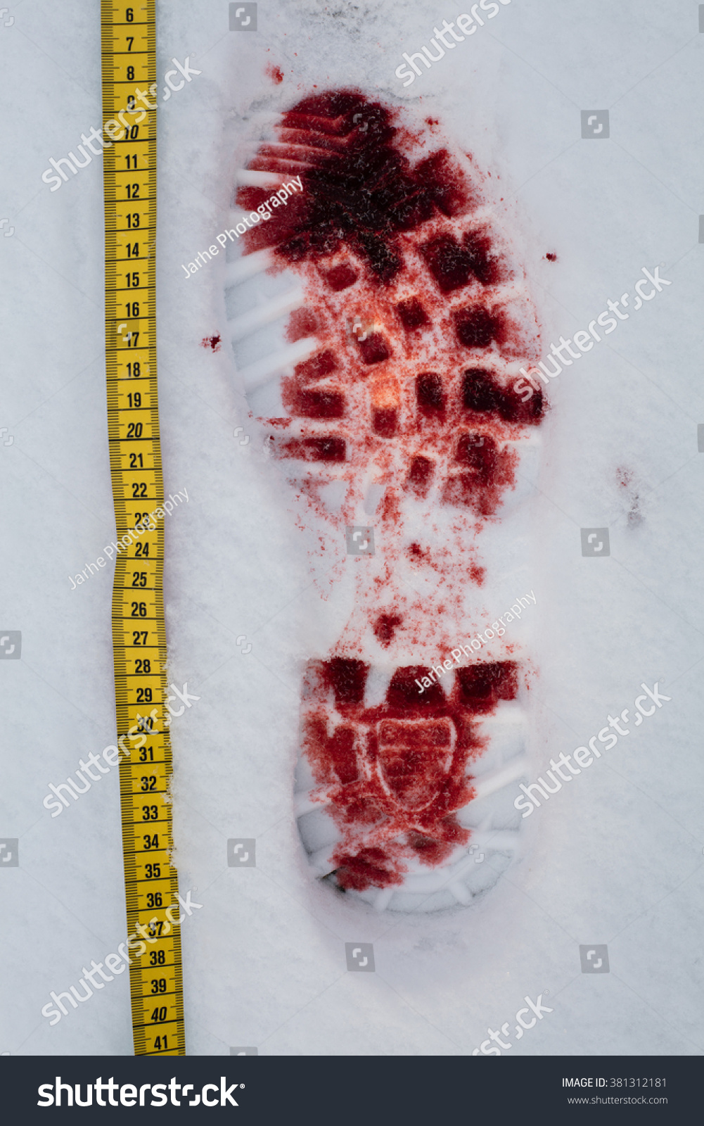
Here are the final screenshots and progress for my In Cold Blood book cover. I'm really pleased with how it turned out in the end even though it's not what I had originally planned. The route that I started with was doing the bloody footprint as I thought it was quite a crucial part of the book, and what led them into finding the murderers. Although I liked this idea, I just couldn't get it to look how I wanted to. It looked too cartoony and not serious enough for what the book is about.
That's when I just started to play around with some brushes that I had acquired and found the perfect one that looked like blood. I couldn't believe how much it looked like it and loved how it looked. So I played around with that for a bit, using different brushes to add small splatters and texture, and I really like how the final thing came out as a background for a book. I think it looks more professional than the footprint.
I did try and incorporate one of my other ideas of the pyjama shirt, but I still felt that it wasn't looking how I wanted it to look. Researching adult non-fiction books found me thinking that the cover should be really simple and not too cartoon-y looking, which is what led me to my next idea of just using the background I had created with text over the top.
I did try out some hand-written fonts to see if I could make it work with them but I just wasn't feeling that either and I think the Courier New font that I ended up going with felt much better and lent idea to hospital vibes and I think it really works.

I'm really pleased with how the final thing turned out. It's simple and yet effective, drawing you in but not giving too much away, just that it's about murder.
Wednesday 8 February 2017
responsive: illustration friday - up

this weeks theme was 'up'. I decided to go with something simple, a little boy being lifted up by a balloon. i decided to test out a different style, and see how it went. i quite like how it turned out. i didn't want to spend too much time on it, as it's just a small brief, so i just left a simple background, however if i was to do it again with more time i would've spent longer making a proper background with a cityscape or something similar.
Tuesday 7 February 2017
responsive: bear mood board

A little mood board made by one of my collab partners. It shows just some pictures for inspiration, research on Bear and what it looks like. I think it is a good starting point for our project and what we want it to look like. I think I'll do some more research myself too, and not just the packaging but more about the cards themselves and what colours are used etc. More to do with the design.
Saturday 4 February 2017
illustration 2: character artists
Valerie Garnace


I really like Garnance's style. I really like her use of bold colours and simple linework. It's rough but seems controlled at the same time, which seems like a hard style to achieve. I think her characters have a lot of personality even though some might think they are a bit similar.
Angie Nesca


I really like the colours of Nesca's characters. She finds a colour scheme that she likes and rolls with it. The characters have a lot of personality in the way that they are posed and their facial expressions. It's interesting to see her dynamics on a boy and a girl character, i.e the way that they both run is so different.
Sojin Choi


I really love Sojin Choi's work for her fluidity and naturalism. All of the characters are posed really naturally and I really admire that. I think she has a particular talent for making sketchy pieces of art look finished.
Celine Kim

Celine Kim is amazing at using environment and colour to tell the different stories of her characters. I love the way she utilises the colours to portray different emotions and feelings. Her style is painterly, and I am really influenced by this.
Mingjue Helen
I really love how Mingjue Helen can go from a simple use of colour and line, and change it up to a really realistic painterly style but it still look like the same character. I think this is a particular skill that I hope one day I have.
Angie Nesca
I really like the colours of Nesca's characters. She finds a colour scheme that she likes and rolls with it. The characters have a lot of personality in the way that they are posed and their facial expressions. It's interesting to see her dynamics on a boy and a girl character, i.e the way that they both run is so different.
Sojin Choi
I really love Sojin Choi's work for her fluidity and naturalism. All of the characters are posed really naturally and I really admire that. I think she has a particular talent for making sketchy pieces of art look finished.
Celine Kim
Celine Kim is amazing at using environment and colour to tell the different stories of her characters. I love the way she utilises the colours to portray different emotions and feelings. Her style is painterly, and I am really influenced by this.
Mingjue Helen
I really love how Mingjue Helen can go from a simple use of colour and line, and change it up to a really realistic painterly style but it still look like the same character. I think this is a particular skill that I hope one day I have.
Thursday 2 February 2017
responsive: ICB research


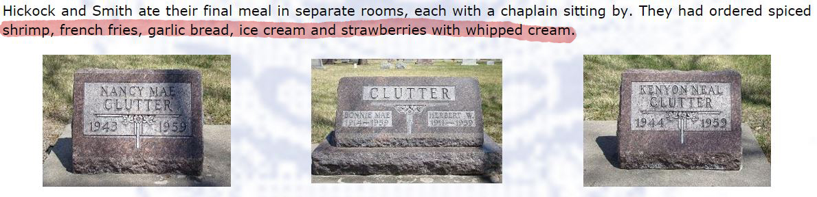

A collection of images I collaged together which includes:
- The Clutter House
- The Policemen moving the bodies
- The funeral of the Clutters
- The basement
- The bloody footprint to the naked eye
- The boot
- The bloody footprint
- Jesus painting Smith did on death row
- Hickock's fingerprint card
- The gallows from whence they hung
- The arrest of Smith

what do bloody footprints look like? one from the crime scene is very simple so wouldn't really work as a front cover because wouldn't know what it is. would this be too comical?? too obvious? maybe make it more simple.
Wednesday 1 February 2017
responsive: illustration friday - mischief

this week's illustration friday theme was 'mischief'. For this I decided to depict a little girl who had raided her mother's make-up drawer which I myself used to do when I was younger. I thought this was a sweet innocent way to use the word mischief as the word itself seems more delicate than something say like 'villainous'.
i decided to keep the colours fairly simple. I wanted the focus to be on the fact that the child doesn't know how to use the lipstick so it's all over her face, so by not colouring in her face I think the red of the lipstick stands out more. I chose a pastel background so that the figure itself also stood out and I think it goes well with the theme of innocence and playfulness.
Subscribe to:
Posts (Atom)