Thursday 31 March 2016

vis com: computer mushrooms


thought i would make a separate post for these so i can talk about them a bit more. i quite enjoyed playing around on photoshop and i'm pretty pleased with how these turned out i think they look pretty snazzy. however i don't think they're where i want to go with this project. THEY ARE PSYCHEDELIC. the one thing i said i didn't really want to do. what an idiot. and i think the text feels kind of bland as well and doesn't really say anything to me. need to figure out my thoughts and come up with some new stuff cos this is getting me nowhere.

Wednesday 30 March 2016

vis com: mushrooms

since i love drawing mushrooms so much i thought i would roll with the idea of some mushrooms possibly. would doing it all about mushrooms be boring? i'll find out.


really love this effect !!! it looks so trippy and awesome. picking red and blue was such a good idea. thanks beth. youre welcome beth.


wanted to start trying to work with different media so i'm breaking out the beloved watercolours which i haven't worked with that much recently and have really missed! *kisses*


trying to think of different ideas for the mushrooms // postcards, poster stamps. i really like the idea of tying nature in with it as he was a hippy and nature is such an important part of their culture. i also really like the colour scheme.


little postcards. really like the blue and red (don't know if i said that yet...) but i especially like the one in the bottom left because it looks trippy without being too in your face, it says something about the mushrooms.


starting to try and figure out ideas for my poster. i really like this piece but i'm afraid that i'm falling into that psychedelic trap that i didn't want to be a part of. will work with this more and see where it goes.


remembered this other quote from the documentary after referring back to my notes on this cool dude. i really love this quote as i think it really says something about him and who he is and it refers to the mushrooms too which is super cool (look at it all tying in HUH)


although i really like this piece that i did i dont think it really says anything. i'm falling into that boring trap that i didn't want to be a part of but i'm losing motivation when it comes to how many mushrooms i can draw. although they are really cute and fun i think i might have to try and rework my ideas because otherwise it's just gonna be a pile of shite.

Thursday 24 March 2016

vis com: getting there!

i'm starting to tie together my thoughts about what i want to do for this project. still trying to stay away from the typical psychedelic theme that i've seen some people fall into the trap of. i just want to do something a bit different (does that make me a hipster? oh god) but yeah. 


still loving the mushrooms. also really like them as an idea for my stamps. i'm not sure yet what colours or anthing like that, but i also really like the little leaf motifs too i think theyre cute. i don't wanna fall into the trap of just doing cute stuff though and forgetting the brief.


pills pills pills. just testing some stuff out here and making sure that little pills are deffo not the way i want to go. i was right. i don't like them at all. they look boring and non representative of who he was. nah.


trying to work out some colours that i want to use as i obviously want some sort of theme running throughout otherwise it'll look stupid and not a set. i did the little red and blue scribbles and i really liked this effect! it kind of reminds me of 3D like trippy stuff so i might try and roll with these colours and see where it takes me.

Sunday 20 March 2016

vis com: initial sketches

started off by doing some initial sketches to get my head around this crazy guy called timothy leary. he's so interesting!!


so i started off with what i think is the basics of what everyone probably thought of to do. (good one beth) i know straight away that i dont want to just go with the flow and do something boring because he had such an interesting life!! no psychedelic basic hippie stuff i want to add more about his personal life.


a really cool phrase that he had!!! i really like this phrase, its short and simple but is quite powerful and i would like to incorporate it somehow but now just by using text because i want to use imagery too.


a bit more personal about his first wife. i like the imagery behind these images but not sure if i want to go with such a heavy subject, he was such a fun energetic guy i dont want him to be portrayed by the death of his wife.


some little imageries which i didn't like too much, and the famous rock brain. i'm sorry, my brain looks so terrible i dont even know what i was thinking.


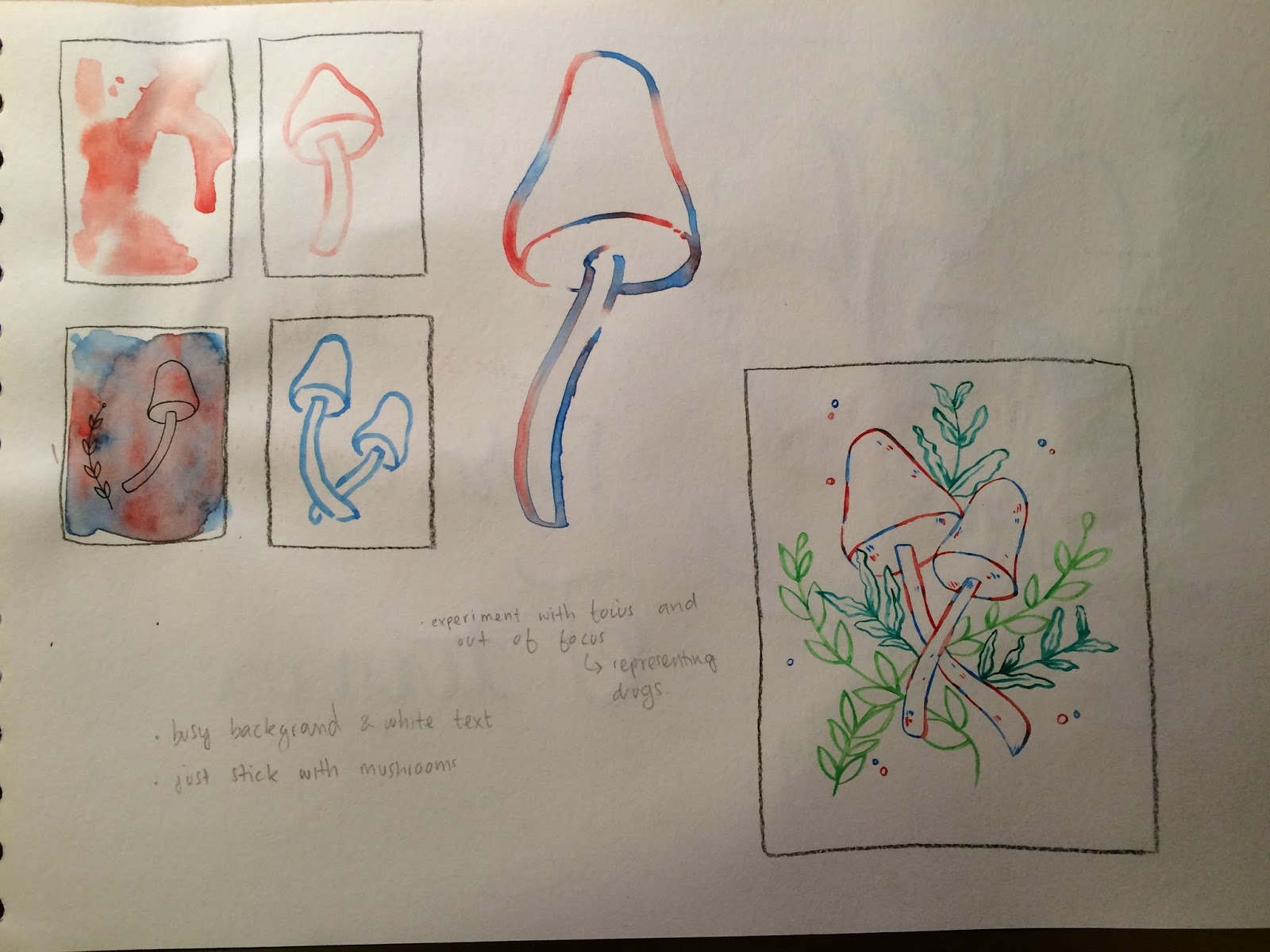
cute little mushrooms!!! i really love drawing mushrooms, i dont even know why it's just so fun. i think these represent a lot about him as they were his first try at drugs so they have meaning.


this guy launched his damn ashes into space !!! like what ? that's bloody crazy. i wasn't quite sure how to represent ashes in space, so i thought the little grave motif was quite cute.


some more little bits about him. not too crazy about these ones either. the balloon represents the fact that he wouldn't have any medication for his cancer other than marijuana and helium balloons, he was overall a pretty chill out doooood.

Thursday 17 March 2016

vis com: sam cooke

Sam Cooke was a trailblazing recording artist who helped shape the soul and pop scene with hits like "You Send Me," "Chain Gang" and "Sad Mood."

Born on January 22, 1931, in Clarksdale, Mississippi, Sam Cooke sang with the gospel group the Soul Stirrers before going on to land huge hits like "You Send Me," "Wonderful World," "Chain Gang" and "Twistin' the Night Away." Forging a link between soul and pop, he had a diverse repertoire that attracted both black and white audiences, and started his own record label and publishing company. Cooke died on December 11, 1964, in Los Angeles, California.


No one knows for certain what exactly happened in the early hours of December 11, 1964. Cooke had been out the night before, reportedly drinking at a Los Angeles bar where he met a woman named Elisa Boyer. The pair hit it off and eventually ended up at the Hacienda Motel. There the couple had some type of altercation in their room, and Cooke then ended up in the motel's office. He reportedly clashed with the motel's manager, and the manager shot Cooke. Cooke died from his injury, which the manager claimed was inflicted in self-defense. It was later ruled justifiable homicide.


Tuesday 15 March 2016

vis com: timothy leary - the man who turned on america


the documentary was a really interesting look into leary's life. i really enjoyed it! (i am a lover of documentaries). i got some really good notes on the documentary and loads of ideas with it. looking at my notes will really help me in the sketching process and i am really thinking that Leary might be my final decision of who i'm going to base my project around!
his life was so interesting and full of really crazy and amazing things, which is really inspiring me to do some drawings.

vis com: timothy leary

Timothy Leary was a noted Harvard lecturer and researcher who became an advocate for LSD and later an entertainment figure.
Born on October 22, 1920, in Springfield, Massachusetts, Timothy Leary forged a career as a noted psychology professor and researcher before becoming a major, highly controversial advocate of psychedelic drugs during the 1960s. He was imprisoned on marijuana charges, yet escaped only to be caught. He later worked in entertainment and cybernetics and published many books. He died on May 31, 1996.


Arrest and Escape

After declaring his candidacy for governor of California in 1970, Leary was arrested on marijuana possession charges and received a decade-long jail sentence. He broke free from prison with outside help several months later and traveled abroad before being recaptured in Afghanistan in 1973. He was re-imprisoned and was ultimately released by state governmental decree in 1976.


There is a documentary on YouTube which i am going to watch to see if I can find out anything interesting about him!


  • bright colours
  • psychedelic 

Monday 14 March 2016

vis com: first task

we were given a first task to do to introduce us to the new brief. it was to pick a famous person and recreate a poster about them without using their face. i really got stuck into this task and was quite excited. i really like the idea of doing something which will symbolise the person instead of being the person. 

the first person i did was donald trump. it was a little bit of a joke (as you can see.. he's a penis) because i thought of the idea and although normally my work is 'cute' and stuff i thought i'd push the boat out and do something quite satirical and political. 

i then liked my tom hanks idea, as he is very famous for his role as woody the cowboy, the famous line 'there's a snake in my boot'. i think this really represents him in a really simplistic way.


this is the tom hanks poster. i thought i would try out cut paper for this one as i thought it was interesting to try something i dont normally do and i wanted really simple block shapes and nothing too complicated. this one didn't take me ages so i thought i would do the donald trump one as well.


i did this poster using watercolours. i think it came out really hilarious and got quite a lot of funny comments from my peers who all seemed to really like it. it was fun for me to try something different and be funny in my art as well as stating opinions on political matters.

vis com: amelia earhart


Amelia Earhart, the first female pilot to fly across the Atlantic Ocean, mysteriously disappeared while flying over the Pacific Ocean in 1937.


Synopsis

Aviator Amelia Earhart was born on July 24, 1897 in Atchison, Kansas. In 1923, Earhart, fondly known as "Lady Lindy," became the 16th woman to be issued a pilot's license. She had several notable flights, becoming the first woman to fly across the Atlantic Ocean in 1928, as well as the first person to fly over both the Atlantic and Pacific. In 1937, she mysteriously disappeared while trying to circumnavigate the globe from the equator. Since then, several theories have formed regarding Earhart's last days, many of which have been connected to various artifacts that have been found on Pacific islands—including clothing, tools and, more recently, freckle cream. Earhart was legally declared dead in 1939.
 
I also thought I would research a bit into already existing illustrations of Amelia that people have already made. I'm doing this for reference and to get an idea of what are the main points of her life. I also think it would be a good idea to look at the 'basic' representations of her so that if I was to carry on with this idea, I would try and think out of the box.
 

Sunday 13 March 2016

vis com: finished postcards

 Here are my finished postcards! I love them. i'm so proud of myself for trying illustrator and really enjoying it. I think that i did have an advantage when it comes to illustrator as i did Graphic Design at A Level, so i used the programme for 2 years. 

 I really enjoyed making my designs simple, as when you compare the drawings and the vectors they are really different. i really wanted to focus on making the designs simple. even when it came to things like adding background, i thought the outfits on there own did it enough justice and that they didn't need anything else adding into the mixture to make the designs too complicated. i had some struggles along the way, for example working out how i wanted the designs to look, whether i wanted to look into character or just focus on the dress. I also wanted to use negative space and simple colour palettes so i had to change the colours around of some of them. The only one which had two colours in it was the Vietnam one, because the headdress had to be gold as that's how the outfit is in real life. If not for this, i would've liked for the designs to be more simple. All in all, i'm really pleased with how they've come out and the work that i've done. 

visual language: evaluation

1.  Which practical skills and methodologies have you developed within this module and how effectively do you think you are employing them within your own practice?

I have really enjoyed experimenting and exploring my skills as a practitioner within this module. I think that before I started this module, I was very restricting of myself and how I did art. So during this module it has really helped me to open up and try new things. It has given me the confidence to test things out and figure out ‘what makes a good drawing’.

2. Which principles/ theories of image making have you found most valuable during this module and how effectively do you think you are employing these within your own practice?

Thinking about composition has really helped in my practice. I think learning about composition and how it can be used has helped me to create new pieces of art with background, focus and different lines of sight. I find it really interesting how you can draw the eye to a certain part of a piece, and I would like to carry on practicing this principle.

3. What strengths can you identify within your Visual Language submission you capitalise on these?

I think I have begun to not be scared of the idea of roughing, and not being too precious with my sketchbooks. To open up more and explore different things without them having to look ‘perfect’ and ‘pristine’ which is how I think I first started to make work in my sketchbook, but by the end I think I am more open with my sketchbook and use it more as a tool rather than a perfect piece of art.

4. What areas for development can you identify within your Visual Language submission and how will you address these in the future?

I think I would still yet to learn to be more open with my sketchbook. Although I think I have come a long way from the beginning of the semester, I want to be able to experiment more and try new things out without being scared of it going wrong or looking ‘ugly’; or more what I define to be ugly. I think I have opened my eyes to a new way of looking at drawing, and how I can use it as an experimental tool, so I would like to try and continue this practice and improve myself as a practitioner.

5. In what way has this module informed how you deconstruct and analyse artwork (whether your own or that of contemporary practitioners)?

I think this module has really helped me in defining what is good drawing. Before I was very critical of even things that just weren’t proportionally sound, but now I catch myself thinking ‘what if this arm was a little bit longer, it would look fun’. I have begun to have more fun making artwork rather than worrying about it having to be perfect. I also think I have got more interested in different practitioners, rather than relying on artists who just work with proportional figures and complex drawings. I have found a new love for the out of the ordinary!

6.How would you grade yourself on the following areas:
(please indicate using an ‘x’) 

5= excellent, 4 = very good, 3 = good, 2 = average, 1 = poor

1
2
3
4
5
Attendance


x

Punctuality


x
Motivation


x
Commitment


x
Quantity of work produced


x

Quality of work produced


x
Contribution to the group


x

Saturday 12 March 2016

vis com: vietnam postcard


i started off with doing the skin, as this is the easiest part for me and the grounding of the postcard. and it's easy to do this as i know i'm not going to manipulate the skin much.


next i did the hair and the headband, i struggled a bit with the colour scheme of this postcard which you can also see in the next screenshot. the other postcards have a small colour scheme of basically one colour but used darker or lighter. however, after researching this outfit i found that the headdresses are mostly gold or a different colour from the outfits and because i wanted to keep true to the traditional outfit, as that is what my project is about, i kept the gold and red colours. 


i'm not sure if i will end up regretting this colour scheme but i still quite like how the colours work together so i'm going to keep it and see how i feel.


adding in the white lines to make the sleeve more noticeable and so you know where her arms are and it's not confusing, obviously. i do like the white lines because i like being able to see the sleeve but i'm not sure if i just like them without... the simple look. but then again i want people to know exactly how the garment looks so i'll leave it as it is.


the finished thing! pretty pleased with how this one turned out, i like the colours and i like the hairstyle the best i think. i do like the flowers too i think they really add something nice to the pieces instead of it just being block colour.