Sunday 30 October 2016
Friday 28 October 2016
Tuesday 25 October 2016
illustration 1: printed pictures tutorial

this crit was really helpful for me! we talked about where my ideas were going and what was working and what wasn't. They really liked the idea of doing panels on all the different prints, the only thing is that Ben said that the ones I had done as sketches might be a bit boring. Just him climbing a mountain or something. He said to create a "Murakami World" where things weren't just normal. This flicked a switch in my head and I have so many new ideas that I'm so excited to do. I'm going to draw a world for my little Murakami. They also said they didn't like the Japanese words on top of his head because writing "foreigner" on his head might be seen as offensive and I totally get this I don't know why I didn't really think of it like that before. Oops.
Other than that I'm excited to get started with the next part of my project. Time to create a little world for my guy.
Monday 24 October 2016
responsive: study task 1
what is a brief?
noun
to what extent the briefs will allow you to meet your criteria for success within the module and to what extent the briefs will benefit you with regards to the value of entering competition briefs
i think responding to live briefs will be beneficial to my practice as it will be realistic to the situation that i will be in when i come to leave university. responding to briefs from real life clients feels more professional than in university and gives me less room for mistakes. at university i can get a lot of feedback from peers and tutors, whereas the client is expecting me to be fully professional and provide a final result that will satisfy them.
Identify any technical or skills challenges that may need addressing
i think one skill that will be challenging for me is the collaboration part of the module because i know that i do struggle a bit with perfectionism and i hope that i don't become too over-bearing for the people who decide to work with me. i know that i will need to get over my need for my own sense of perfection and be open to ideas and drawings from others.
Part 2 - Based on your response to Part 1, select one of the three briefs that you think will provide an opportunity to fulfill the criteria discussed in the studio session.
I have chosen Bear, YCN
noun
- 1.BRITISH
a set of instructions given to a person about a job or task."his brief is to turn round the county's fortunes"
synonyms: instructions, directions, directives, briefing; verb- 1.
instruct or inform (someone) thoroughly, especially in preparation for a task."she briefed him on last week's decisions"
synonyms: inform of, tell about, bring up to date on, update on, notify of, advise of, acquaint with, apprise of, give information about;
- They set guidelines & expectations - helps you to know what is expected of you and what you are working towards
- Gives good communication
- The end product will be better as a result of setting clear criteria and objectives
to what extent the briefs will allow you to meet your criteria for success within the module and to what extent the briefs will benefit you with regards to the value of entering competition briefs
i think responding to live briefs will be beneficial to my practice as it will be realistic to the situation that i will be in when i come to leave university. responding to briefs from real life clients feels more professional than in university and gives me less room for mistakes. at university i can get a lot of feedback from peers and tutors, whereas the client is expecting me to be fully professional and provide a final result that will satisfy them.
Identify any technical or skills challenges that may need addressing
i think one skill that will be challenging for me is the collaboration part of the module because i know that i do struggle a bit with perfectionism and i hope that i don't become too over-bearing for the people who decide to work with me. i know that i will need to get over my need for my own sense of perfection and be open to ideas and drawings from others.
Part 2 - Based on your response to Part 1, select one of the three briefs that you think will provide an opportunity to fulfill the criteria discussed in the studio session.
I have chosen Bear, YCN
- What problem(s) are identified by the brief?
Making the cards collectible and identifiable for children.
- What is the brief asking you to do about it/them?
Do research about what children like/want.
- What is the brief trying to achieve?
Bringing joy to children and teaching them to eat healthier through collecting cards together
- Who will benefit?
Children's health will benefit and parents who are trying to get their children to eat healthier foods
- What is the message?
Eating healthy
- Who is the audience?
Children 4-9
- How will the message be delivered?
Through advertising, selling the food product, and a website with fun games and interactive activities
The deliverables for the project are at least 3 BEAR mockup cards
The deliverables for the project are at least 3 BEAR mockup cards
- Can you foresee any problems in responding to the brief?
Making sure that the theme chosen is appropriate for the target audience age of 4-9.
Making sure that the cards aren't 'cute' but informative.
Wednesday 19 October 2016
illustration 1: a mini comic?
I'm really enjoying drawing this little guy and coming up with different ideas on my final pieces. This is the progress and I'm trying to work out how they will look like as final pieces. I'm doing this now because no matter how many sketches I do I need to work out what it will look like at the end.
The idea that I'm going for is a mini comic on each print showing the little character being on his own. I wrote down a few more ideas on what I could do on the side in gold pen. I also asked some of my peers for ideas on what they think i could do and wrote those down too. I really like this idea and I think it could really work in showing the progression of his isolation instead of just one stand alone image. It also shows how he likes to be on his own because he is putting himself in those situations instead of the other interpretation that he could have ended up like that unwillingly.
The idea that I'm going for is a mini comic on each print showing the little character being on his own. I wrote down a few more ideas on what I could do on the side in gold pen. I also asked some of my peers for ideas on what they think i could do and wrote those down too. I really like this idea and I think it could really work in showing the progression of his isolation instead of just one stand alone image. It also shows how he likes to be on his own because he is putting himself in those situations instead of the other interpretation that he could have ended up like that unwillingly.
responsive: choosing 3 briefs
TASK: Identify 3 briefs just from D&AD + YCN - why have you chosen these?
I chose the BEAR brief first because it is the one that caught my eye the most. I have been interested in BEAR products for a while and the fruit wind ups are one of the best snacks out there. I also chose it because I think it is quite suited to my illustration, which is based a lot around character design.
I chose this brief because I am really interested in getting into doing something like this. I love cards, postcards and wrapping paper and finding ones with beautiful designs is so fun to collect and to use. I would like to do something like this in the future when I am a working illustrator, so to have the opportunity to try it now would be good for my practice.
The last brief that I chose was also because I am very character driven when it comes to doing work so I think that this brief would suit me really well. I have read Roald Dahl books since I was a very small child so the characters are very dear to my heart, so it would be fun to replicate them in my own style.
illustraton 1: printed pictures initial sketches
So this is a little Issuu with some of the inital sketches and some of my commentary on how I feel about them. I do have some concerns for this brief. I really want to try screenprinting again but last time I was so terrible at it and I had so many issues. But I just really love how screenprints look so if I can try and look around that and work my way forward I might be able to try. I'll have to do a lot of tests. I'm also excited to try out different ways of printing (lino & mono) because I've never really done these before and it seems so exciting to be finally trying some new things!
Tuesday 18 October 2016
illustration 1: progress tutorial

today i had a progress tutorial with theresa just to talk about where I am, how i'm feeling and how the project is going. I told her about how I'm really bad at sleeping and I feel like sometimes it effects how i work and she told me to get more sleep. She also said that I need to make sure that I keep up with COP as I fell behind a bit because i'm so focused on the project we're doing in Illustration 1 at the moment. I understand this and I do tend to do this, focus on one thing and forget about all the others so I will try and get better at this. Other than that she said that I am on track and I need to make sure that I do keep blogging like I am.
Sunday 16 October 2016
Friday 14 October 2016
illustration 1: study task 3
next task! to find some illustrators who use the print process. i already have some in mind too!
hel covell
hel covell is one of my favourite ever illustrators. there's something about her work that is just so naive and beautiful. here she is using risograph printing which we are not doing but i just really wanting to include her in and i think researching about risograph printing might be interesting too. i chose these two pieces because they are two of my favourite. they are both so strikingly different. the first is really simple and most likely only took one print and it was done, one colour, one stock. really easy. the second one (the rabbit) i think was done with risograph and scanned in to add different block colours and elements to it. so you can see she is using the digital printing method of scanning in your prints. although the rabbit print is technically three colours, i still think it's a good example of how to effectively use colour and contrast.
richelle bergen
 the next artist that i have recently discovered is richelle bergen. she works mostly with lino printing and her results are beautiful! she does quite simple colour palettes which is perfect for this brief as we are doing the same. the thing that i like about her lino print is that they look so perfect. it's crazy to think that she has cut out all these little sections and it's so interesting to me how it's possible. i would love to try and get this perfect effect, however i also do really like when lino prints have texture because it makes them look printed rather than just digitally printed.
i think its interesting her use of the red watering can and the black flowers, most likely two seperate lino prints, i might play around with doing this as we are allowed to use two colours so adding this image in really gave me some ideas.
loulou and tummie
loulou and tummie are a duo of illustrators who work together to create these graphic like designs. this top one is a screenprint and the bottom one is a risograph print. i really love this screenprint and think it's a perfect example because of the two colours they have chosen. you can see they have chosen blue and red, and then overlapped the colours to create this brown colour. this is exactly the example i was looking for because it uses the two colour boundary and pushes it as much as it can. i also really like the graphic nature of their prints, they look digital, but are handmade. i would really like to try and dabble in this style because my style is always so traditional and sketchy/inky, it might be fun to try and do something like this. I also think their compositions are really interesting. The pages are busy and there is so much to look at with different things happening. the screenprint seems to be a little comic strip that goes from left to right and i think this is such an interesting way to do this! having no borders really makes you think it's just a print and when you properly look, you realize there is a story.
hel covell
hel covell is one of my favourite ever illustrators. there's something about her work that is just so naive and beautiful. here she is using risograph printing which we are not doing but i just really wanting to include her in and i think researching about risograph printing might be interesting too. i chose these two pieces because they are two of my favourite. they are both so strikingly different. the first is really simple and most likely only took one print and it was done, one colour, one stock. really easy. the second one (the rabbit) i think was done with risograph and scanned in to add different block colours and elements to it. so you can see she is using the digital printing method of scanning in your prints. although the rabbit print is technically three colours, i still think it's a good example of how to effectively use colour and contrast.
richelle bergen
 the next artist that i have recently discovered is richelle bergen. she works mostly with lino printing and her results are beautiful! she does quite simple colour palettes which is perfect for this brief as we are doing the same. the thing that i like about her lino print is that they look so perfect. it's crazy to think that she has cut out all these little sections and it's so interesting to me how it's possible. i would love to try and get this perfect effect, however i also do really like when lino prints have texture because it makes them look printed rather than just digitally printed.
 i think its interesting her use of the red watering can and the black flowers, most likely two seperate lino prints, i might play around with doing this as we are allowed to use two colours so adding this image in really gave me some ideas.
loulou and tummie
loulou and tummie are a duo of illustrators who work together to create these graphic like designs. this top one is a screenprint and the bottom one is a risograph print. i really love this screenprint and think it's a perfect example because of the two colours they have chosen. you can see they have chosen blue and red, and then overlapped the colours to create this brown colour. this is exactly the example i was looking for because it uses the two colour boundary and pushes it as much as it can. i also really like the graphic nature of their prints, they look digital, but are handmade. i would really like to try and dabble in this style because my style is always so traditional and sketchy/inky, it might be fun to try and do something like this. I also think their compositions are really interesting. The pages are busy and there is so much to look at with different things happening. the screenprint seems to be a little comic strip that goes from left to right and i think this is such an interesting way to do this! having no borders really makes you think it's just a print and when you properly look, you realize there is a story.
illustration 1: editorial finished pieces & final crit


I really enjoyed this brief. I think editorial is fun, i'm not sure if it is something that I could see myself doing in the future but as a little side thing it might be interesting. I do like how these turned out, I like the ink pen and how it works for the image, however I do wish I'd tried out more things. Maybe changing the colour schemes or trying it out with a coloured background, I don't know. I don't think that I was experimental enough and just went with something that I liked the look of. Next time I will make sure to try out different colours with things instead of just choosing a colour I like and going with it.
In terms of things that I think went right, I am really happy with the look of it. I think buying an ink pen has really made my work so much more interesting (thank u amazon). And I do think that the gold really works with it, and makes it stand out. Enforcing the message behind my work and how Murakami is one of a kind in the Japanese literature world.
Tuesday 11 October 2016
illustration 1: editorial peer review

had another crit for my editorial work today. a lot of people were saying that they really like the brush pen and how it works. most of the comments that i got were really positive. Someone mentioned about doing blue because of the theme of isolation and being on his own but I mentioned about how he likes to be on his own so i don't want it to look sad because that would be the opposite of what I'm going for. They did agree with this comment in the end. I think choosing to do gold is the way to go because it's such a regal colour and I do think he is one of the best.
Saturday 8 October 2016
illustration 1: editorial making
Friday 7 October 2016
Wednesday 5 October 2016
illustration 1: editorial crit #1
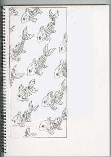
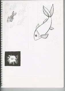
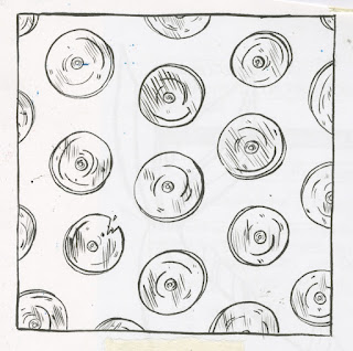
so today we had the first crit for our ideas. i think that it went well, everyone seems to like the ideas that i have done so far. i didn't do exactly 60 but no one murdered me over that (haha). ben was saying that he really liked the patterns that i did and i agreed that they were one of my favourite ideas so possibly try and refine those a bit more. they were saying to make sure to try out lots of different ideas though and don't get stuck just wanting to do one which i completely agree with.
so a lot of stuff to go away with! and now time to get doing more drawing and refining which i'm excited about because i really like some of my ideas. ben was saying that even if there is ideas that i don't end up using i could possibly use them in the next brief. so i'm feeling pretty confident about this project at the moment, we'll see if that carries on.
so a lot of stuff to go away with! and now time to get doing more drawing and refining which i'm excited about because i really like some of my ideas. ben was saying that even if there is ideas that i don't end up using i could possibly use them in the next brief. so i'm feeling pretty confident about this project at the moment, we'll see if that carries on.
Tuesday 4 October 2016
Sunday 2 October 2016
illustration 1: study task 2
choose two illustrators from the editorial scene that i am interested in. okay!! i don't really look at editorial too much so it'll be interesting to find some stuff that tickles my fancy.
dawid ryski

I like this piece because of the simplicity but also the message. The artist is literally portraying the phrase 'you have to jump through hoops' to get where you want in life. The contrast of the more dull colours in the background as opposed to the man and the hoop which are bright colours make the man stand out and he is the focal point of the image.

I like this piece because he has only used three colours, so his colour palette was restricted and as this brief is similar I was really interested to see how he followed it. I think the choice of scale and simplicity is really interesting and how he used these tools to his advantage, how humans are so consumed by technology.
I found David Ryski after looking on Behance for some editorial illustrators. I am really fond of how simple his work is. I think as this project is two colour, finding his piece where he has only used blue and pink is really amazing because it shows how much you can do with just two colours.
I found an interview with him at "http://culture.pl/en/artist/dawid-ryski" and he mentions "It was a breakthrough moment for me. I was asked to create album artwork for my friends’ band. Meanwhile, I also started playing drums in a Warsaw-based band. I was immediately appointed the band’s official graphic designer."
and that "I came to terms with working on a computer, and was beginning to acquaint myself with Photoshop."
For me, it was really interesting to find someone like this that i actually really love. Normally i am all into character design etc, but there's something charming and clean about Ryski's work that I really admire.
owen gent
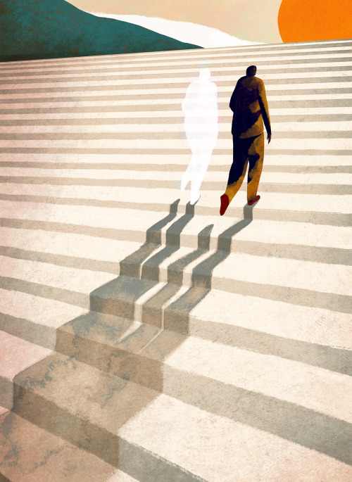
I chose this image because I think the imagery is really powerful. The artist's choice of composition really stands out, how the vast staircase goes off into the sunset, how the shadow is white instead of black is compelling, what is the message behind this? Is the shadow white because you can see right through it? The choice of material is beautifully scene in the shadows as the watercolour spreads and creates lovely texture.
Once again I found Owen Gent whilst also on Behance (such a great website to find cool illustrators). His work caught my eye because of its handmade yet digital feel, i was really curious as to his process and how he makes.

He posted this image on his tumblr account referencing that it was a work in progress on Photoshop. For this to be made on Photoshop is amazing to me I would love to sit behind him and watch him work, I will never understand how people can get these amazing textures and depth whilst using digital software. I would really like to get into learning more about it myself and giving it a go.
dawid ryski

I like this piece because of the simplicity but also the message. The artist is literally portraying the phrase 'you have to jump through hoops' to get where you want in life. The contrast of the more dull colours in the background as opposed to the man and the hoop which are bright colours make the man stand out and he is the focal point of the image.

I like this piece because he has only used three colours, so his colour palette was restricted and as this brief is similar I was really interested to see how he followed it. I think the choice of scale and simplicity is really interesting and how he used these tools to his advantage, how humans are so consumed by technology.
I found David Ryski after looking on Behance for some editorial illustrators. I am really fond of how simple his work is. I think as this project is two colour, finding his piece where he has only used blue and pink is really amazing because it shows how much you can do with just two colours.
I found an interview with him at "http://culture.pl/en/artist/dawid-ryski" and he mentions "It was a breakthrough moment for me. I was asked to create album artwork for my friends’ band. Meanwhile, I also started playing drums in a Warsaw-based band. I was immediately appointed the band’s official graphic designer."
and that "I came to terms with working on a computer, and was beginning to acquaint myself with Photoshop."
For me, it was really interesting to find someone like this that i actually really love. Normally i am all into character design etc, but there's something charming and clean about Ryski's work that I really admire.
owen gent

I chose this image because I think the imagery is really powerful. The artist's choice of composition really stands out, how the vast staircase goes off into the sunset, how the shadow is white instead of black is compelling, what is the message behind this? Is the shadow white because you can see right through it? The choice of material is beautifully scene in the shadows as the watercolour spreads and creates lovely texture.
Once again I found Owen Gent whilst also on Behance (such a great website to find cool illustrators). His work caught my eye because of its handmade yet digital feel, i was really curious as to his process and how he makes.

He posted this image on his tumblr account referencing that it was a work in progress on Photoshop. For this to be made on Photoshop is amazing to me I would love to sit behind him and watch him work, I will never understand how people can get these amazing textures and depth whilst using digital software. I would really like to get into learning more about it myself and giving it a go.
Subscribe to:
Posts (Atom)
