Wednesday 20 April 2016

vis com: evaluation

1.  What have you learn about visual communication during this module and how effectively do you think you have applied these ideas?

I have learnt a lot through this module. I have tried out so many new and different ideas and themes that I never thought that I would tackle. Making the gifs was one of them, being able to try out this new way of working was really fun and exciting for me and even though some parts were difficult along the way, I have learned to persevere with it to the end. I also learned that sometimes simplification is a really effective way to reduce your ideas so that they are not over complicated. I 
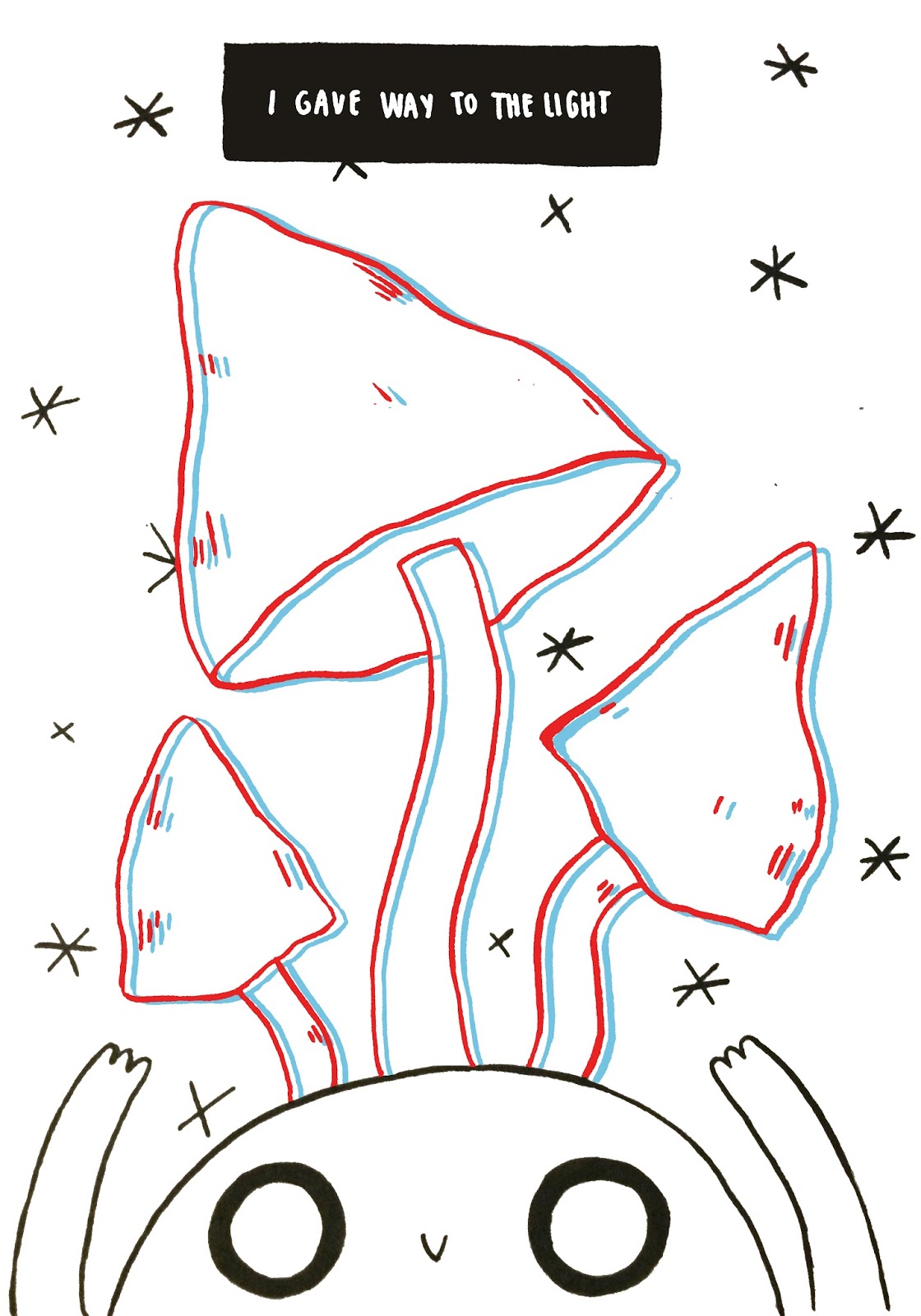
think I effectively applied this within the Greetings From brief, where I really enjoyed learning about simplification and applying it to my work in my sketchbook as well as my final products.

2. What approaches to/ methods of image making have you developed and how have they informed your concept development process?

As I said in the last point, I think I have really utilised simplification in this brief. I have used it in these past briefs quite effectively and have really enjoyed doing it. It has really been interesting to me, as someone who is obsessed with detail and has always produced it within my practice, to make my drawings simpler and get different effects from them. I also think that as well as simplification, I have really utilised different ways of drawing within this brief. I have been trying out many visual signatures throughout this brief, not wanting to just pin myself down to one way of working, and I think it has showed through my work.

3. What strengths can you identify in your work and how have/will you capitalise on these?

I think one strength that I have had through these projects is the beginning stages where I am trying out different ideas and changing ideas. I think you can see this especially in the 
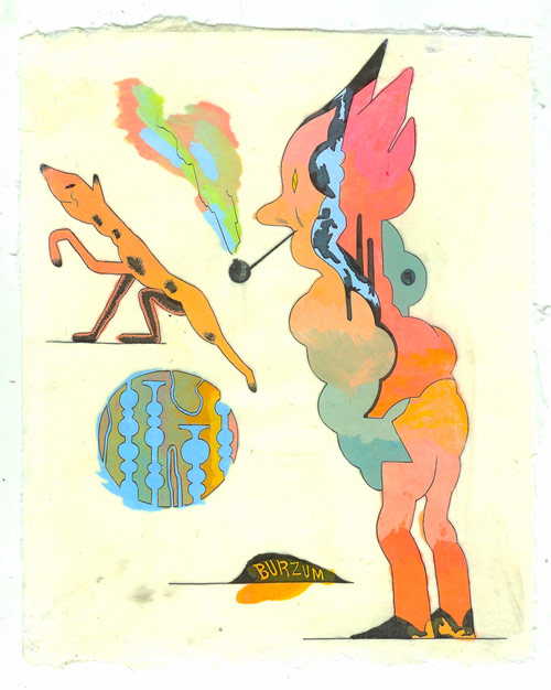
Persons of Note brief, where my ideas spiralled and I tried out many different things in order to find what I wanted my work to look like. I think this way of working is really helpful especially to someone like me, who is really bad at decisions and always asking for other’s advice. I think I have begun to break away from that even though I do still ask for opinions on my work, within these briefs I have tried to be myself as well and do things that I want to do.

4. What weaknesses can you identify in your work and how will you address these in the future?

I think one of my weaknesses, although I have begun to break away from it, is still asking for people’s opinions too often. I need to start just going with my gut and doing what I like instead of always asking for advice and sometimes being disappointed with the answer. However I understand that sometimes getting an outside opinion can be really helpful. I also think one of my weaknesses was not using a wide enough range of different materials. Apart from the briefs where we were asked to use the computer, I don’t think I went out of my comfort zone enough. I didn’t try out things that I really wanted to because I held myself back, using clay being one of them. I think in the next brief/next year I would really like to push myself even more into trying something different and experimenting more with my practice. 

5. Identify five things that you will do differently next time and what do you expect to gain from doing these?

I would go with my gut and do the work I think will become successful. I will gain from this the knowledge that I am independent and my own boss, and not taking too much ideas and advice from people will make my work feel more personal and like my own.

I would possibly try screen printing, I did ponder it on the Persons of Note brief but in the end I didn’t do it. Next time I want to push the boat out. I think doing different things will open up new ways of working for me.

Try more with backgrounds and composition. I didn’t really use much background/composition for any of the briefs. Next time I would like to try and make myself do more, as it is good practice and can give my work more grounding.

Make sure to stick to the brief instead of getting carried away just drawing things that I enjoy. I seem to find something I like drawing and get so carried away with drawing it that I 
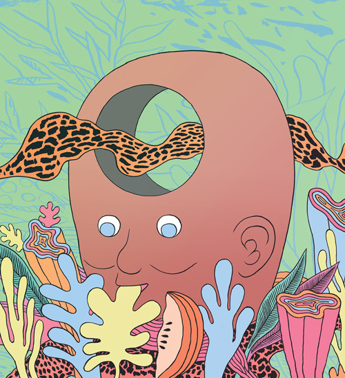
forget what the project is about or what I have to do in the end. I found this at times with the Persons of Note brief and the I See Faces brief. I want to stick to my brief more next time and keep it in mind.

Look at more artists to give myself inspiration. Even though I think I did look at quite a few artists, I want to look at even more to give myself inspiration and help me through the briefs.

6.How would you grade yourself on the following areas:
(please indicate using an ‘x’) 

5= excellent, 4 = very good, 3 = good, 2 = average, 1 = poor

1
2
3
4
5
Attendance


x

Punctuality


x
Motivation


x
Commitment


x
Quantity of work produced


x
Quality of work produced


x
Contribution to the group


x

Tuesday 19 April 2016

vis com: postcards stress

as a suggestion from the crit session, people were saying for me to try and incorporate the little guy in maybe my postcards or something else so that he wasn't just a loner on the poster. so i started doing some drawings of him that will fit onto the postcards.


i wanted the little guy to fit the theme of the postcards, so on the mushroom one i did a little guy with a flower crown to fit with the floral theme that i had going on. I also decided to do them in ink because i did a few in fineliner and it just didn't feel as nice as the ink did.


then i also did a little space guy to try and fit in with the space font. however, i was a little worried that he kind of just looks like a guy stuck in a bubble. i asked for some feedback from my flatmate and they said to possibly add buttons to his arm or change the antenna a bit.


lastly i was a bit stuck on what to do for the last one as it really is just a psychedelic pattern. however when i got thinking about it i was trying to match 'psychedelic' with something and obviously hippie is what comes to mind so here he is.


i then added them onto the postcards and moved the font up a little bit so that they would fit on. 

however i actually really don't like how they turned out. i think it kind of made it look a bit more ugly. even though the little guy is kind of cute i just really don't think it fit well with what i wanted to go with. there was the idea of putting the stars on it which i did in the  top one and then possibly do other things on the other postcards but i just really wasn't feeling it and missed the simple design that i had done... at least i tried. right?


instead of changing the design to have the little guys on it, i did a different suggestion from matt which was to make the type a little bit smaller as he said it felt like they were kind of squished onto the page. i was a bit dubious at first because i didn't want the type too small cos then you wouldn't be able to see the intricate design i had done on them but he made the point of saying that you have to pick them up to look at the design anyway so making them smaller wouldn't really hurt so i thought he had a point. 

i made the font a bit smaller so it didn't feel as squished onto the page and i think that it looks fine so lets just go with that.


vis com: crit & stress

so today we had the final crit before the deadline. it went quite well but a few things were said about little details that i should change. some things i didn't really understand or i'm not sure they really understood my theme. what i was going for was quite a simplified look with not too much going on and the red and blue theme running through to tie them together as a set, however they were saying to maybe add more colour or backgrounds and this just isn't what i wanted.
there were some comments about the original idea for my poster being too boring/doesn't stand out enough. i didn't really know what to do for this because i didn't want to change my whole design, and i actually really liked how the design came out. i thought i used the space quite well. so i'm kind of running with my own gut feeling and keeping the design that i wanted (sorry guys)


i did change some things to it though so that the mushrooms stood out more as a focal point, by just making them the only thing on the poster that has the fuzzy 3D effect. i think this way i am kind of keeping to the feedback from the group as trying to make the mushrooms stand out more than the little guy at the bottom. and i also redid the poster again in ink because i think it gave it a nicer effect than the clean fineliner. i was debating doing the postcard type again in ink instead of fineliner but i just didn't have time which was a shame, this would be something that would've been done had i had more time on it.


Monday 18 April 2016

vis com: poster tries


So i finished my poster for this project and i was pretty happy with it. However, the next day after staring at it for a while i realised i could do better so i decided to draw it again but instead of drawing it on A4 i did it smaller in my book so i could get a feel for the frame more and the outcome was much better:


i think i optimised the space more on this one and i like the added textures to the mushrooms. I think i considered the frame more and used it to the best of my ability, and i also like how the mushrooms don't touch eachother (sounds stupid but you know) because i think it looks more open and free.

vis com: patrick kyle

when i was talking to matt today he recommended some artists for me to look at. patrick kyle was one of them. his style is really interesting. he works mostly with a lot of colour and strange concepts that don't always make sense. i think that is why matt recommended that i look at him because he is dealing with a lot of similar subjects to what i am doing in this project right now. i really admire his out there concepts and his nice use of colour. although this is not normally an artist i would particularly like, i think looking at his work has been helpful to the type of work that i am trying to achieve with this brief.

vis com: little character

here are some experimental drawings that i did of the little character after matt mentioning something about him today. in my crit people were talking about maybe developing him a bit more.


a few roughs on possible new postcard designs, but just don't think i'll have time to start all over again.


really like how he looks like a little bean. and i think in the professor outfit is really cute!


some of the sketches and designs that i did for the little guys and possible designs to go onto the postcards.

vis com: more sketchbook


starting to get more of my ideas onto paper. i decided to go with a space-themed font for 'turn on'. i think this really matches the aesthetic that i'm going for and it has some representation to how drugs make you feel "out of this world" haha cliche right? i think this really fits.


i struggled for a bit with the 'drop out' title. when i put it into photoshop (the eyes design) i really didn't think that they fit as a set. as the eyes design has parts coloured in whereas the other designs don't. this proved to be a problem when making them a set, as the others didn't have parts coloured in.


doing more final designs for the poster that i'm going to do. i really like the one in the top corner. i think he looks super cute. i'm not sure how the pencil will work on photoshop though, so i'm going to do it in fineliner so that it fits in more with my postcards.


testing out some font ideas for my poster. i want the font to be pretty small so it doesn't have to be too fancy, just something kind of simple. i did want it to be hand made though, which is why i didn't just use a font from photoshop. i really enjoy doing fonts and figuring out which looks best and which material looks best when doing fonts.


drawn out the poster design in fineliner. however, when putting it onto photoshop and stuff i really didn't like how i hadn't optimised the space enough. i didn't even realise this until i had put it onto photoshop. i had also forgot to do some texture lines on the mushrooms which annoyed me.


testing out more fonts and working out a way around the 'drop out' font. i started to try and do the eyes without colouring in the irises but it didn't really end up looking anything like eyes so it looked kind of dumb. ended up going with the pattern design that i did a few pages before that i liked as i think it fits with the psychedelic hippie theme.


drawing out final designs!


vis com: postcards

some processes from my postcards. here you can see me figuring out colour and how the text will fit onto the page.


in this one i was playing around with the manipulation feature. it was quite funny but i don't think it really works for what i'm going for, and it really distorted the designs of the type so that you can't really see what it is so i dont think i'll be doing this.


Friday 15 April 2016

vis com: stamps

  when thinking of the designs for the stamps, i wanted to be able to portray the different ways in which drugs effect you when you take them. at first the designs were quite simple as you can see on the left, but then i wanted to make them a bit more interesting, so taking inspiration from one of the mock up

 postcards that i had made from the other week. i decided to do a repeated pattern like you can see on the right. i think this way they look a lot more interesting and they portray the 'trippy' nature that i wanted to have.


i am much happier with the outcome of the repeated pattern, even though it was only a simple change i think that they are much more effective this way. it really shows the effects of drugs in a more interesting way and without using crazy colours and intricate designs. instead its quite simple, and the act of taking drugs is simple, it doesn't take much to put a mushroom in your mouth. i think my stamps say a lot.

Tuesday 12 April 2016

vis com: cut paper experimentation

I decided to buy some cut paper from the library to test out some other ideas that i had to do with the fonts. i really liked the idea of doing the pattern all behind it and then doing a simple font over the top. the red and blue from the library were really bright and vibrant and i liked that.


first i started by using the negative space that i had cut out of to see what the pattern would like behind it. this didn't really work though it just kind of looks like a lot of scribbles behind some red paper. so this idea didn't really work but it's okay thats what it's all about right? trial and error..


I then tried putting the little letters that i had made on top of the design and i actually really liked this!! i think the font really stood out with the words hitting you in the face and then the background made it look really pretty. however after asking a few of my peers if they preferred this or the font as flowers, they all said they proffered the font. after looking at it for a bit i did realise that the font idea was better but i do still like this!


Before completely throwing away the idea i decided to do another tester to see what it would look like on a background other than the flowers which i treasure. however when i did this it just really didn't have the same effect as the flowers. 


edit 20/04/16: after looking back through my work i actually really liked this idea and i think i should've developed it more instead of just listening to my peer's advice. i think if i had done more of the patterns similar to what i did on the finals it would have looked really nice. but i know now for the next projects that sometimes you just have to trust yourself or at least try and develop the ideas more before throwing them out because you might find that in the end they look really cool. if i was going to do this project again i might've developed this idea.

Monday 11 April 2016

vis com: changing direction

after talking with matt for a bit, we decided that i wasn't taking the right route just doing mushrooms. i think i got so into drawing mushrooms and how fun they were that i forgot for a second who i was doing it about and the message that i was trying to portray. for this reason i decided to take a completely different direction and not so much start again, but try and evolve my ideas more.


i started by thinking of ideas for my postcards. i really like the idea of doing the quote 'turn on, tune in & drop out' because it is 3 little words and it'll fit the postcards really nice.


because i really enjoyed doing mushrooms and nature and i still want my pieces to have some aspects of this in, i decided to do the font with flowers & mushrooms. i think this really worked nicely and got some nice results from my peers. at first i was thinking of just doing the flowers for each of them but then i was thinking that this might be boring and taking the easy route so i decided that i should do different things for each of them. therefore deciding that the flowers & mushrooms fit the quote 'tune in' more as i think i hear that kind of quote more when people are talking about hippies and tuning into nature.


i also needed to rework my poster. there was a little doodle that matt did on my sheet where there was space and more shape than figurative. i drew this out and i do quite like it.


i also looked a bit into the molecular stucture of the drugs as i thought maybe incorporating them somehow might be interesting. 


however after doing some testers and trying out some shape as well, i decided that it just wasn't working as well and i liked the other idea that i have much more because i think they will work together.


trying out some different ideas with the font idea, i had an idea to do a slimey kind of font as a representation of how drugs can be quite scary and gross. but when i did it, i looked at it and i was like 'this look like a goosebumps font' and that was when i decided not to do it lol.


drew out the spacey idea onto bigger paper to get more of an idea of what it will look like. i think i'm going to skip this idea because i feel like its not authentic enough. matt was the one that gave me the idea for it so it doesn't feel enough like MY work and MY idea so i'm going to try and come up with my own original idea.


i really liked the drawing of this little guy that i did a few pages back so i decided to do a few more sketches of different ways he could look. i really like the introduction of the arms, it feels like he's reaching up to the sky which really goes well with the quote 'i gave way to the light'. i also like his eyes being open as i think it shows the drugs in effect and the fact that the quote is about drugs.