dawid ryski

I like this piece because of the simplicity but also the message. The artist is literally portraying the phrase 'you have to jump through hoops' to get where you want in life. The contrast of the more dull colours in the background as opposed to the man and the hoop which are bright colours make the man stand out and he is the focal point of the image.

I like this piece because he has only used three colours, so his colour palette was restricted and as this brief is similar I was really interested to see how he followed it. I think the choice of scale and simplicity is really interesting and how he used these tools to his advantage, how humans are so consumed by technology.
I found David Ryski after looking on Behance for some editorial illustrators. I am really fond of how simple his work is. I think as this project is two colour, finding his piece where he has only used blue and pink is really amazing because it shows how much you can do with just two colours.
I found an interview with him at "http://culture.pl/en/artist/dawid-ryski" and he mentions "It was a breakthrough moment for me. I was asked to create album artwork for my friends’ band. Meanwhile, I also started playing drums in a Warsaw-based band. I was immediately appointed the band’s official graphic designer."
and that "I came to terms with working on a computer, and was beginning to acquaint myself with Photoshop."
For me, it was really interesting to find someone like this that i actually really love. Normally i am all into character design etc, but there's something charming and clean about Ryski's work that I really admire.
owen gent

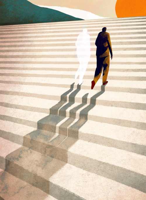
I chose this image because I think the imagery is really powerful. The artist's choice of composition really stands out, how the vast staircase goes off into the sunset, how the shadow is white instead of black is compelling, what is the message behind this? Is the shadow white because you can see right through it? The choice of material is beautifully scene in the shadows as the watercolour spreads and creates lovely texture.
Once again I found Owen Gent whilst also on Behance (such a great website to find cool illustrators). His work caught my eye because of its handmade yet digital feel, i was really curious as to his process and how he makes.

He posted this image on his tumblr account referencing that it was a work in progress on Photoshop. For this to be made on Photoshop is amazing to me I would love to sit behind him and watch him work, I will never understand how people can get these amazing textures and depth whilst using digital software. I would really like to get into learning more about it myself and giving it a go.

No comments:
Post a Comment