
Showing posts with label OUIL505. Show all posts
Showing posts with label OUIL505. Show all posts
Tuesday, 9 May 2017
Monday, 8 May 2017
illustration 2: finished prints!
Here is a presentation of my finished prints! The colour on them isn't great, but that's the picture's fault not the actual prints. The prints look great, I'm really happy with how they turned out. I think deciding to do the square in the middle of the page is really effective and makes them look a lot more professional. I decided to go with Matte paper because I didn't want the image to shine and you not be able to see the image.
Sunday, 7 May 2017
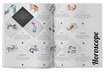
illustration 2: application
Here are some mockups for the applications that I would want to see my Zodiac project on.
I chose the following:
I chose the following:
- Magazine Backpage
- T-shirts
- Apps
- Phone Cover
I chose these because I think it best suits my project. I wanted the horoscope pictures to be used mostly for things like magazines, books about horoscopes etc, because I think they really work for this. It's because you always have that page at the back where they tell you your horoscope for the month, and there is always a small picture or symbol to help to show which one is which. I think this is a good place to put my work and it will be seen by a wide audience.
I also chose phone covers and t-shirts because I think that the horoscopes are a very collectible item, therefore people might purchase them for everyday use too. Everyone has a star sign, it's a given, so I think this makes people very interested in them. That's why I think it will be a very collectible item as everyone will want whichever one is their star sign.
I also chose app for this reason. In the modern age of technology there is an app for everything. So, therefore, there are plenty of apps for horoscopes. They tell you everything about you and your horoscope. I think this is also a really good place for my drawings.
Saturday, 6 May 2017
illustration 2: finished illustrations


Here are my final illustrations for my Zodiac brief! I am super happy with how they have all turned out and I think I have come a long way within this brief. I think the idea to turn them into squares instead of filling the whole sheet was a good idea, not only for time management but for the more professional look as well. I think that they look a lot neater this way and are all matching eachother really well. It was also more of a challenge for me, in a way, to figure out how to make each composition work within the frame of the box.
illustration 2: looking at lighting
As my ideas grow over the course of creating them, I've decided I want to add more atmosphere to my pieces by using lighting. Lighting is an effective way to make any situation seem lifelike and without it my illustrations look kind of flat. I know I'm just taking one step at a time with the whole trying of the new things but I just think it will really help my illustrations because right now I feel like they look flat.

Minkyung Jang

Miki Montlló

Trotroy
Looking at all these examples has been really interesting, I've never took so much time to research about lighting before I always just kind of winged it and hoped for the best. However now I feel more confident going into my drawings and doing it.

Minkyung Jang
Miki Montlló
Trotroy
Looking at all these examples has been really interesting, I've never took so much time to research about lighting before I always just kind of winged it and hoped for the best. However now I feel more confident going into my drawings and doing it.

An example of where I have utilised these new skills that I have made! I think it gives the piece a much better atmosphere and tone, plus you can tell it's at nighttime now or she has her curtains closed whereas before I had no idea where the lighting was coming from.
Friday, 5 May 2017
illustration 2: the last crit


So we had the last ever crit of this year today. It was really fun (if not a little bit daunting) to see everyones work, which was so amazing. I'm really happy with how my work is turning out and I think I am taking these final steps into the right direction. There was not a lot of constructive feedback which is a bit disappointing, but it is nice to be told that people like your work.
Sunday, 23 April 2017
illustration 2: a sea of faces


As practice for character design I decided to have a go drawing my characters with lots of different facial expressions. It was really fun, especially to see how each face works so differently. It's quite rewarding to know that all the faces are different and work so differently as someone who was so used to drawing the same face all the time. I've had a lot of fun working out how to make them look in response to their personalities. So their shocked, happy, angry etc faces all look different. For example, the aries 2nd face shows a more childish anger, almost as if he is being naughty, whereas the pisces 2nd face shows a more mature anger.
illustration 2: the jungle


I used this piece as reference and inspiration for the background for Leo. I wanted the background to be quite simple and a lot of green, because that's really what jungles are. Plus Leo and the other animals are going to be quite bright I think if the background is more simple they will stand out more. It's helpful for me to use references because i wouldn't have known where to start otherwise.
Friday, 21 April 2017
illustration 2: deciding on colours
This was one of the really fun parts of character designing. Choosing the colours. I wanted the colours not just to represent the sign, but also to match with the environments. What I mean is, for Taurus, I am thinking of doing a scene with her in the garden so to have her in a green jumper might be a bit of overkill on the green. I want to make sure that I choose the right colours for this reason. It was also a new experience for me, as I have never really gone into this much depth with character designing but it's a lot of fun. I can't wait to do more in the future on different projects.
Tuesday, 18 April 2017
illustration 2: environment research
Scott Watanabe

Scott Watanabe is an illustrator who works for Disney. His environments and interiors are immense and so inspiring. He is really good at getting the right perspective and colours, shadows etc. I am kind of jealous that someone is that good (haha). Looking at his work has really inspired me to try hard with my environment backgrounds even though i'm not looking forward to it that much.


Scott Watanabe is an illustrator who works for Disney. His environments and interiors are immense and so inspiring. He is really good at getting the right perspective and colours, shadows etc. I am kind of jealous that someone is that good (haha). Looking at his work has really inspired me to try hard with my environment backgrounds even though i'm not looking forward to it that much.


Using my trusty friend Pinterest (the best thing to exist in the whole world ever) I collected some research about environments and interiors. I know that for some of my illustrations I do want them to be outside, so I looked at things like the Jungle (for leo) as I want to do a kind of 'King of the Jungle' spin off. And i also looked at inspiration for the woods because I think I might also do a drawing in the woods. It's helpful to look at these to gain some inspiration and some knowledge before diving right into it, however it does make it quite daunting as I think 'i can never do this'. But i'll give it a good go!
Monday, 17 April 2017
illustration 2: figuring out colouring

I wasn't really sure which direction I wanted to go with in terms of colouring. There were many different styles, softwares and brushes that I can use. The one on the left is a Kyle Webster gouache brush, and I do like the effect of this one however I feel like the character doesn't stand out enough. The middle was done using a software called Paint Tool Sai, where it is easy to change the colour of the linework to match the image. Although I like this style too, I just think it wasnt working for the aesthetic that I wanted to achieve. Therefore the one I think i'm going to go with is the one on the right, which is bold black lines and simple colour. I don't want to overcomplicate them too much because I want the characters to speak for themselves. They are also going to be in situations where there is a lot going on around them with lots of colour and objects, so I don't want to overcomplicate this process either.
I think it was good for me to test out these different ways of colouring, because it has helped me to see my characters in different ways. I think for the cartoon style I am trying to achieve, the one on the right is the best fit.
Wednesday, 5 April 2017
illustration 2: playing with posing


As someone who is not normally very good at posing my characters. With this project gave me a really good reason to try it out and have a go at something new. I really struggle to keep my work rough, so even when i'm doing sketches there's always the voice in the back of my head telling me to be more neat. I do want to try and break out of this, however I still was quite neat within these sketches. I think by doing these posing sketches I am really learning more about anatomy and how the human body works. This is a very useful skill to have and I hope that one day I can draw poses without needing a reference for them.
Tuesday, 4 April 2017
Monday, 3 April 2017
illustration 2: magazines that have horoscopes
I decided to do some research on some of the bigger magazine companies and if they provide a Horoscope within them. To my surprise there were a lot of them, especially all of the bigger brands. It's surprising to me that it is still so popular after all these years, even though horoscopes have probably had a lot of bad press and wrong answers.


Saturday, 1 April 2017
Thursday, 30 March 2017
illustration 2: magazine publishing
As one of the ideas that I have for my Application part of this project is a publication or horoscope page in the back of a magazine, I thought I would do some research on what it's like to get into magazine publishing and if it would be possible for me to do it.
I found these tips from: http://www.writerswrite.com/journal/jun03/eight-tips-for-getting-published-in-magazines-6036
Tip 1: Do your Research
Tip 2: Discuss the Idea With the Editor First
Tip 3: Submit a Proposal
Tip 4: Listen to the Editor's Advice
Tip 5: Grab the Reader
Tip 6: Submit Articles Electronically
I found another list quite similar to this from: https://goinswriter.com/how-to-get-published-in-a-magazine/
Step 3: Write a query letter
I found these tips from: http://www.writerswrite.com/journal/jun03/eight-tips-for-getting-published-in-magazines-6036
Tip 1: Do your Research
Tip 2: Discuss the Idea With the Editor First
Tip 3: Submit a Proposal
Tip 4: Listen to the Editor's Advice
Tip 5: Grab the Reader
Tip 6: Submit Articles Electronically
I found another list quite similar to this from: https://goinswriter.com/how-to-get-published-in-a-magazine/
Step 1: Start with a topic
Think of an idea that is original, interesting, and compelling.
Try to do some free-writing or mind-mapping to flesh it out on paper.
Focus on what you know, on what you have a unique perspective on.
Step 2: Make a list
Do some research. Take note of a few publications you’d like to pitch. Make sure you have a good variety. This will increase your chances of getting published with one of them.
I usually pick a few smaller and larger publications when I do this. I vary the list to improve my chances.
Step 3: Write a query letter
Query letters are short, formal letters that you send to to the editor to consider you for publishing. If the magazine has more than one editor, send it to the person who accepts pitches for your particular topic.
Address him or her by name, include the date, and pitch the idea in a short outline form.
It’s also a good idea to provide some sample work that you’ve done (in the form of links, preferably, if you have published anything online).
If appropriate, try including more than one idea in the letter. This will increase the likelihood of getting a response.
Step 4: Wait
This is important: Give the magazine adequate time to respond.
If they have a policy for pitching articles, read it. Most likely, it will be something like this: “If you don’t hear back from us in [X amount of time], you can trust that we weren’t able to use your piece.”
Wait a week or so before following up. If you don’t hear back within a few weeks to a month, send a letter to the publication, telling them you’re moving on with the idea. When in doubt, ask permission to follow up. For example, if I’m wanting a quick response on a piece, I may say:
If I don’t hear back from you in a week or so, would it be all right for me to follow up?
If they say yes, then you never have to feel awkward about sending a follow-up.
Step 5: Follow up
If they do respond to your pitch, they will tell you one of the following:
a) They don’t like the idea.
b) They want you to tweak the idea.
c) They want to publish the idea.
b) They want you to tweak the idea.
c) They want to publish the idea.
Oftentimes, I go back and forth with a publication before we land on a good idea.
Once you land on a good idea, they may ask for outline.
Once you’ve agreed on a deadline, then it’s time to start writing. The hardest part is done. Now, all you have to do is write the article. And next time, you probably won’t have to go through this process. The more you do this sort of thing, the easier it gets, especially as magazines and editors begin to know and trust you.
- It seems like its quite hard to get into publishing for a magazine or article paper. However I feel like it's different for horoscopes because there's always one in there somewhere so there's always a market for it
- One thing that I could do is work with the writer for the horoscopes and just submit my designs to them instead
Tuesday, 28 March 2017
illustration 2: mystic meg


One of the applications that I am looking at for my end illustrations is Horoscopes at the back of magazines, for example 'mystic meg' etc. I really this this is a good application for my illustrations because it is something that's really relevant. It would give my work a chance to be seen by a lot of people and i think a lot of people would find it interesting as to why I have drawn the characters these ways and want to find out more.
Sunday, 26 March 2017
illustration 2: face shapes

Before I did this, I tasked myself with trying to draw as many different face shapes as I could. I think this is good practice for me as someone who doesn't take much time to rough things out and practice.

It was really interesting for me to challenge myself into how many unique face shapes I could create. It has really put some things into perspective for me, and I think I have learned a lot from this process.

I then wanted to dedicate a page to me just testing out using all these different face shapes. I wanted to see if I really could create characters that looked different and unique. I think this was quite successful and I managed to make quite a few new characters. I am now more confident when thinking about redesigning my characters and have more of an idea about how I should approach it.
Subscribe to:
Comments (Atom)