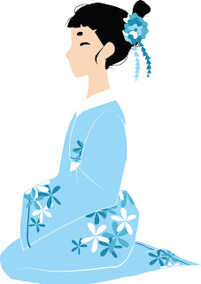
the first thing that i changed was removing the lip. i don't know why, but i thought it would make the face look a lot more simpler and take the attention away from it enough for people to look at the garment.
the next thing that i did was change the colour of the kimono. i chose a sky blue because i researched that blue was a popular colour for kimonos and looked more pure.
i then changed the hair piece from the other draft that i did. i thought the flower looked a lot more traditional and i really like how it turned out on my other piece. i think it adds enough complexity whilst still being simple, but it is important because i want to add all of the aspects of the dress, including a proper hairstyle.
i started to add flowers to the kimono. flowers are often used in kimono designs. i wanted to keep the flowers simple so they are typical simple shapes.
i added more flowers on the sleeve as i was just going to keep them on the body but i thought it needed more than just the flowers there, as the rest looked quite bare.
i added more flowers, a few to the bodice and a few on the bottom. i also added some lines around the edges of the kimono like in my original drawing, i just think this ties is together quite nicely. i also changed some of the flower, adding some white in it to correspond with the dress.
the finished lady! now i just need to work out how to create some sort of background that won't take too much attention away from her.
i've done a simple background for now. i'm not sure whether i will keep it just like this but i quite like how it's simple because i don't want to take away too much from the garment. i used cherry blossoms as they are japan's flower, and i wanted to use some of my research.
as well as taking away the lipstick i have taken away the lip all together. i think it makes the piece look a lot simpler and cleaner as the little bump sticking out of the face looked a bit strange. i really like how the face has turned out and i think i'm going to use the same face shape for all of the postcards so there is a consistency within them. i have been finding using illustrator quite rewarding, as i have used it before, but i didn't really get into the software very much. however this time i have been really enjoying simplifying my work and adding little details with the pen tool.


No comments:
Post a Comment